8 Minutes
Android Pickers Explained: Choosing Dates, Times, and Files in Your App
Fix Bugs Faster! Log Collection Made Easy
Introduction
Pickers enable Android developers to minimize error-free input and optimize everyday features of their apps, such as date selection, delivering crucial gains in user experience.
Users can validate input data by pressing a single button, and ensure structured input without any typing errors (in fact users don’t need to type an input at all). And we can customize the picker to our specific needs, creating better UI for our users.
We can open Android pickers simply by extending the DialogFragment class, and in Android we can implement them in two distinct ways, either in XML layout or by writing the code in a Java/Kotlin file.
But this is only the top line. If we want to truly get the most from our pickers, there’s stacks of other stuff to consider. And today we’re going to drill down into it, focusing on:
- The types of pickers available to use.
- How to customize pickers to our needs.
The article is designed for Android developers with a basic knowledge of pickers, who want to take their game to the next level.
Table of Contents
What you’ll get from this blog
You’ll emerge with a much sharper, more detailed understanding of how Android pickers work, which means:
- Your Android application will allow users to choose between data options more smoothly, with no failure-point.
- You get better data at the backend, because Android pickers offer pre-defined options.
- Our users can’t type manually into the input field, which again reduces the likelihood of errors.
- We can harness pickers’ responsive technology, which is easily accessible on all devices.
- We make our Android apps more versatile and provide for smoother location transitions. Two of the picker types we’ll cover today,
DatePickerandTimePicker, automatically change their values when our users move region.
Types of pickers
First, we’ll look the pickers that Android Studio provides out of the box, and how to use them when building an Android app.
Android carries four primary types of default pickers. Let’s unpack them.
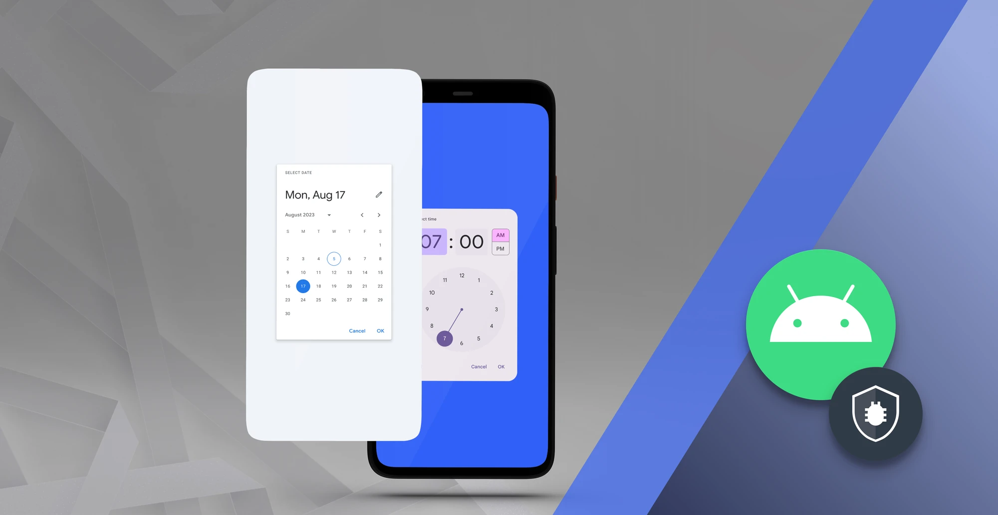
Date Picker
Date selection is crucial to loads of different types of Android application, from hotel booking sites to gyms, taxi services and business calendars. And date pickers are extremely useful here, allowing our users to select a date from a drop-down list without having to enter it manually. To show a dialog, we need to write the below code in our Java/Kotlin file:
val datePickerDialog = DatePickerDialog(
    context,
    { _, year, month, dayOfMonth ->
        // Handle the selected date
    },
    year, month, day
)
datePickerDialog.show()
- We need to pass the current year, month, and day in the dialog constructor.
- Then, the show method is used to display the dialog.
Here is an example of how to use the date picker widget directly in the layout:
<DatePicker
    android:id="@+id/datePicker"
    android:layout_width="wrap_content"
    android:layout_height="wrap_content"
    android:calendarViewShown="true" />
- The
calendarViewShownproperty is used to show theDatePickerin calendar view, or not. - To show the
DatePickerin spinner mode, we need to passfalsein thecalendarViewShownproperty. - We can set
minDateandmaxDateproperties for a selected date range. - The
minDateproperties help us hide the previous date of the current month.
Time Picker
This helps us to display a time widget in the app. Again, time pickers are great when we need to build apps for hotels, travel sites, or gyms. There are two ways we can show the time, either in 12-hour or 24-hour format. Here is an example of how we can open a time picker dialog:
val timePickerDialog = TimePickerDialog(context,
  { _, sHour, sMinute ->
      // Handle the selected time
   }, hour, minute, true
  )
 timePickerDialog.show()
- We need to pass hour and minute in the dialog constructor.
- Then we must pass true to show the dialog in 24-hour format.
- The show function is used to show the dialog.
Here is an example of how we can use the time picker widget directly in the layout:
<TimePicker
    android:id="@+id/timePicker"
    android:layout_width="wrap_content"
    android:layout_height="wrap_content"
    android:timePickerMode="spinner"
    android:is24HourView="true" />
- There are two ways we can show
TimePickeron screen, either in spinner mode or clock view. - For spinner mode, we need to set the property
timePickerModetospinner. - The
is24HourViewproperty is used to show theTimePickerin AM/PM format.
Number Picker
In Android, Number Picker is used to select a number, so its utility stretches to practically any kind of app. ****We can directly use the NumberPicker widget in a layout, as shown below.
<NumberPicker
    android:id="@+id/numberPicker"
    android:layout_width="wrap_content"
    android:layout_height="wrap_content"
    android:minValue="1"
    android:maxValue="10"
    android:wrapSelectorWheel="true" />
We can set the minimum value of the widget using the minValue property. Similarly, for the maximum value, we will use the maxValue property.
Drop Down Picker
In Android programming we know about spinner, which is also known as the Drop-Down picker and allows users to select a value from a list. We need this picker for all kinds of apps, and here’s an example of the dialog:
<Spinner
    android:id="@+id/spList"
    android:layout_width="wrap_content"
    android:layout_height="wrap_content" />
val spList: Spinner = findViewById(R.id.spList)
val adapterList = ArrayAdapter(context, android.R.layout.simple_spinner_item, listOf("Apple", "Banana" , "Orange"))
spList.adapter = adapterList
spList.onItemSelectedListener = object : AdapterView.OnItemSelectedListener {
    override fun onItemSelected(parent: AdapterView<*>, view: View?, position: Int, id: Long) {
        // Handle selection
    }
    override fun onNothingSelected(parent: AdapterView<*>) {}
}
In the above example, we used spinner in the layout file and showed the fruit name. We can select any of three names via this method.
File Picker
This allows our users to choose a file location – in other words, they can choose where they want a file (for example, their Google photos) to be stored at the click of a button. There are three ways we can implement filepicker when building an Android app: by using intent, storage access framework (SAF), and content providers. Here’s how to use intent:
val intent = Intent(Intent.ACTION_GET_CONTENT)
intent.type = "*/*"
startActivityForResult(intent, 1)

override fun onActivityResult(requestCode: Int, resultCode: Int, data: Intent?) {
    super.onActivityResult(requestCode, resultCode, data)
    if (requestCode == 1 && resultCode == RESULT_OK) {

    }
}
If we need to select any type of file from the device, then we need to pass "*/*" in intent.type. For specific types of files, we need to pass their values. For select-only images, we need to pass "image/*" . For pdf files, it’s "application/pdf", and for video files "video/*".
To access the file, we also need to declare the uses-permission tag in the manifest. But, if you are accessing file Android 6 and above, you need to check at runtime.
<uses-permission android:name="android.permission.READ_EXTERNAL_STORAGE" />
<uses-permission android:name="android.permission.WRITE_EXTERNAL_STORAGE" />
if (ContextCompat.checkSelfPermission(this, Manifest.permission.READ_EXTERNAL_STORAGE) != PackageManager.PERMISSION_GRANTED) {
    ActivityCompat.requestPermissions(this, arrayOf(Manifest.permission.READ_EXTERNAL_STORAGE), STORAGE_PERMISSION_CODE)
}
How to customize pickers
So far, we have shown how to implement built-in pickers in an Android app. However, we also need to customize the pickers when our requirements are not met.
Here is some code showing how we can customize NumberPicker. As we know, NumberPicker is used to pick a number from the list of numbers. We can customize this NumberPicker widget in two ways, either programmatically or in a layout file.
<NumberPicker
    android:id="@+id/numberPicker"
    android:layout_width="wrap_content"
    android:layout_height="wrap_content"
    android:wrapSelectorWheel="false" />
Programmatically customize
If we need to customize programmatically, we need to first get the object. Here is the example of how to get the object.
val numberPicker = findViewById<NumberPicker>(R.id.numberPicker)
Now we will set the minimum value and maximum value of that widget, so the user can only pick the range of numbers.
numberPicker.minValue = 1
numberPicker.maxValue = 10
This means we see we can get numbers between 1 and 10 only, not more. We also have the option of customizing through the layout file, without writing code. Let’s see how this works.
<NumberPicker
    android:id="@+id/numberPicker"
    android:layout_width="wrap_content"
    android:layout_height="wrap_content"
    android:minValue="1"
    android:maxValue="10"
    android:wrapSelectorWheel="true" />
And there you have it! A simple method of customizing your Android picker to the app’s specific needs.
To sum up
In Android, pickers are essential UI components that help mobile app users input data without making mistakes, and provide a better user experience that will lead to better reviews in the Google Play Store.
Using pickers improves the focus, smoothness and simplicity of an app, and Android Studio provides three built-in pickers: DatePicker, TimePicker and NumberPicker. Custom pickers are useful when Android developers need a personalized UI component. They are flexible and easy to use in different layouts. Finally, there are two ways to access files; before Android 6.0, the provision of runtime permission is not required, but after version 6.0 it becomes mandatory.
If you have any questions about Android pickers, or any other aspect of Android Studio or Android application development, don’t hesitate to reach out to us.
Expect The Unexpected!
Debug Faster With Bugfender

Anupam Singh
Anupam Singh is a Native Android Developer as well as Hybrid Mobile App Developer. More than 10 years of experience in Developing Mobile Apps. He is a technology blogger. Follow him on Linkedin to stay connected.