
18 Minutes
Jetpack Compose Button Tutorial: From Basics to Advanced Features
Fix Bugs Faster! Log Collection Made Easy
Jetpack Compose (sometimes mistakenly called Android Compose) is a powerful new UI toolkit for Android that embodies the principle of ‘Code As UI’, offering aa simpler and faster way to build native android UI using a declarative approach.
Of all the UI components in Jetpack Compose, buttons have a special place, as these are the cornerstone of our user interface. They allow the user to take actions, submit forms, and navigate around the app smoothly.
In this article, We will go through some more use-cases and advanced features of buttons in Jetpack Compose, so you can add this to your Android developer toolkit and build amazing experiences for your users.
Table of Contents
What you’ll get from this guide
Like all our tutorials, this is designed to give you a sound grasp of the topic in question.
By the end, you should have a sound knowledge of how to create a Jetpack Compose button, and use the button component more generally. This will enable you to create simple buttons (which is actually really easy with Jetpack Compose) and customize them to:
- Add buttons of different shapes, sizes and colors.
- Implement animations to beautify user interactions.
- Effectively manage button states to give real-time feedback, which improves the user experience.
- Compose Buttons with other Composables to build rich UI Components.
This is particularly useful for any Android developer moving from XML-based UI development to Compose, who want to learn the new way and design interactive, visually appealing user interfaces with Jetpack Compose. If you follow Google’s material design system, which is designed to produce high-quality digital experiences, you’ll find this guide particularly relevant.
Ok, ready? Let’s go!
To add a simple Button to our Android project, we need to follow these steps.
Step 1: Set Up Your Project
We need to make sure that our Android Project is properly set up to use Jetpack Compose. We can do this by adding the necessary dependencies to the build, as this coding image shows.
// build.gradle (Project level)
buildscript {
    ext {
        compose_version = '1.0.1'
    }
    // other configurations
}

// build.gradle (Module level)
android {
    // other configurations
    buildFeatures {
        compose true
    }
    composeOptions {
        kotlinCompilerExtensionVersion compose_version
    }
}

dependencies {
    implementation "androidx.compose.ui:ui:$compose_version"
    implementation "androidx.compose.material:material:$compose_version"
    implementation "androidx.compose.ui:ui-tooling-preview:$compose_version"
    implementation "androidx.lifecycle:lifecycle-runtime-ktx:2.3.1"
    implementation "androidx.activity:activity-compose:1.3.1"
}
Now we can create a basic Jetpack compose button in the composable function. This will define the text button and what its on-click behavior will look like.
//Example showing defining a button and click behaviour
import androidx.compose.material.Button
import androidx.compose.material.Text
import androidx.compose.runtime.Composable
import androidx.compose.ui.tooling.preview.Preview

@Composable
fun SimpleButton() {
    Button(onClick = { /* Do something */ }) {
        Text("Click Me for this action")
    }
}
We can use the @Preview annotation to see how the text button looks without having to run the entire app.
//TO immediately preview your composable function directly in Android Studio,
//add the **@Preview** annotation.
@Preview(showBackground = true)
@Composable
fun PreviewSimpleButton() {
    SimpleButtons()
}
It’s important to integrate the button into our MainActivity , so we can get a look at how it workst. We need to sync the ViewModel to handleClick status and set the content of SimpleButton composable.
//Example of adding a button in MainActivity.
import android.os.Bundle
import androidx.activity.ComponentActivity
import androidx.activity.compose.setContent

class MainActivity : ComponentActivity() {
    override fun onCreate(savedInstanceState: Bundle?) {
        super.onCreate(savedInstanceState)
        setContent {
            SimpleButtons()
        }
    }
}
For more in-depth personalisation, we should select the specific colors and shape we want our button to be.
//Example - personalized button
import androidx.compose.foundation.layout.padding
import androidx.compose.material.ButtonDefaults
import androidx.compose.ui.graphics.Color
import androidx.compose.ui.unit.dp

@Composable
fun CustomButton() {
    Button(
        onClick = { /* Do something */ },
        colors = ButtonDefaults.buttonColors(
            backgroundColor = Color.Blue,
            contentColor = Color.White
        ),
        modifier = Modifier.padding(8.dp)
    ) {
        Text("Custom Button")
    }
}
And that’s it! Simple, right?
Now here’s where it really gets interesting. We can use modifiers and styles within Jetpack Compose to transform our buttons’ appearance and suit the overall look and feel of our app.
As their name suggests, Modifiers are what we use to modify composables. We can add padding, background color, size detailing and loads of other stuff to create a unique visual identity. Here’s some code to show you how.
//Example of modify the buttons adding padding, background color, size.
import androidx.compose.foundation.background
import androidx.compose.foundation.layout.padding
import androidx.compose.foundation.shape.RoundedCornerShape
import androidx.compose.material.Button
import androidx.compose.material.ButtonDefaults
import androidx.compose.material.Text
import androidx.compose.runtime.Composable
import androidx.compose.ui.Modifier
import androidx.compose.ui.graphics.Color
import androidx.compose.ui.unit.dp

@Composable
fun StyledButton() {
    Button(
        onClick = { /* Do something */ },
        colors = ButtonDefaults.buttonColors(backgroundColor = Color.Green),
        modifier = Modifier
            .padding(16.dp)
            .background(Color.Green, shape = RoundedCornerShape(8.dp))
    ) {
        Text("Styled Button", color = Color.White)
    }
}

@Preview(showBackground = true)
@Composable
fun PreviewStyledButton() {
    StyledButton()
}
For context:
padding(16. dp) will add some padding around the button.
background(Color.Green, shape = RoundedCornerShape(8.dp) dp)) will make the background color green, with a radius of 8 dp.
Jetpack Compose provides a shape parameter to design buttons with different shapes. The button shape parameter is a Shape object, which will simply render its path.
//Example of Buttons with various shapes:
import androidx.compose.foundation.shape.CircleShape
import androidx.compose.foundation.shape.RoundedCornerShape
import androidx.compose.material.Button
import androidx.compose.material.Text
import androidx.compose.runtime.Composable
import androidx.compose.ui.unit.dp

@Composable
fun ShapedButtons() {
    Button(
        onClick = { /* Do something */ },
        shape = RoundedCornerShape(8.dp),
        modifier = Modifier.padding(8.dp)
    ) {
        Text("Rounded Button")
    }

    Button(
        onClick = { /* Do something */ },
        shape = CircleShape,
        modifier = Modifier.padding(8.dp)
    ) {
        Text("Circle Button")
    }

    Button(
        onClick = { /* Do something */ },
        shape = RoundedCornerShape(topStart = 16.dp, bottomEnd = 16.dp),
        modifier = Modifier.padding(8.dp)
    ) {
        Text("Custom Shape Button")
    }
}

@Preview(showBackground = true)
@Composable
fun PreviewShapedButtons() {
    ShapedButtons()
}
Elevation will make our buttons look like they are raised from the background, so we can define an outlined button and give that lovely silhouette look.
//Button Elevation example
import androidx.compose.foundation.layout.padding
import androidx.compose.material.Button
import androidx.compose.material.ButtonDefaults
import androidx.compose.material.Text
import androidx.compose.runtime.Composable
import androidx.compose.ui.unit.dp

@Composable
fun ElevatedButton() {
    Button(
        onClick = { /* Do something */ },
        elevation = ButtonDefaults.elevation(
            defaultElevation = 8.dp, //This is the elevation to be used in default state.
            pressedElevation = 12.dp, //This is the elevation to be used while button in pressed state.
            disabledElevation = 0.dp //This is the elevation to be used while button in disabled state.
        ),
        modifier = Modifier.padding(8.dp)
    ) {
        Text("Elevated Button")
    }
}

@Preview(showBackground = true)
@Composable
fun PreviewElevatedButton() {
    ElevatedButton()
}
Now we’re really cooking! Let’s move into some advanced features of Jetpack Compose that can make our buttons compelling and interactive.
With Jetpack Compose, we can easily add icons with buttons by using the Icon composable.
//Example of using icons in Compose.
import androidx.compose.foundation.layout.Row
import androidx.compose.material.Button
import androidx.compose.material.Icon
import androidx.compose.material.Text
import androidx.compose.material.icons.Icons
import androidx.compose.material.icons.filled.Favorite
import androidx.compose.runtime.Composable
import androidx.compose.ui.tooling.preview.Preview

@Composable
fun IconButton() {
    Button(onClick = { /* button action */ }) {
        Row {
            Icon(Icons.Filled.Favorite, contentDescription = null)
            Text("Like")
        }
    }
}

@Preview(showBackground = true)
@Composable
fun PreviewIconButton() {
    IconButton()
}
For context, Icon(Icons.Filled.Favorite, contentDescription = null)is an icon-only version of the Favorite, included with Material icons.
Often we need a loading indicator inside the button to let users know that an action is in progress. So in order to create a button with a loading indicator, you can take the following route:
//Example of Button with loading indicator in Compose
import androidx.compose.foundation.layout.Row
import androidx.compose.foundation.layout.Spacer
import androidx.compose.foundation.layout.size
import androidx.compose.foundation.layout.width
import androidx.compose.material.Button
import androidx.compose.material.CircularProgressIndicator
import androidx.compose.material.Text
import androidx.compose.runtime.Composable
import androidx.compose.runtime.mutableStateOf
import androidx.compose.runtime.remember
import androidx.compose.ui.Modifier
import androidx.compose.ui.graphics.Color
import androidx.compose.ui.unit.dp
import androidx.compose.ui.tooling.preview.Preview

@Composable
fun LoadingButton(isLoading: Boolean) {
    Button(onClick = { /* Button action */ }) {
        Row {
            if (isLoading) {
                CircularProgressIndicator(
                    color = Color.White,
                    strokeWidth = 2.dp,
                    modifier = Modifier.size(16.dp)
                )
                Spacer(modifier = Modifier.width(8.dp))
            }
            Text("Submit")
        }
    }
}

@Preview(showBackground = true)
@Composable
fun PreviewLoadingButton() {
    LoadingButton(isLoading = true)
}
For context:
CircularProgressIndicatorwill help in displaying a circular loading indicator in the button.- We need to experiment with the
Rowcomposable, which creates a loading indicator and text horizontally. Spacer(modifier = Modifier.width(8.dp)will add the space in between loading indicator and text.
State management
As a button is the most visible and common element type, we should manage its state to make it more responsive and allow interaction with our UI. Jetpack Compose makes this easy, with the remember and MutableState.
To control the state of a button, we should typically use remember combined with an MutableState variable. This allows us to store and update the state, inside our composable functions.
// Example of how to manage the state of a button
import androidx.compose.foundation.layout.Column
import androidx.compose.material.Button
import androidx.compose.material.Text
import androidx.compose.runtime.*

@Composable
fun ToggleButton() {
    var isToggled by remember { mutableStateOf(false) }

    Column {
        Button(onClick = { isToggled = !isToggled }) {
            Text(if (isToggled) "ON" else "OFF")
        }
    }
}

@Preview(showBackground = true)
@Composable
fun PreviewToggleButton() {
    ToggleButton()
}
For context:
var isToggled by remember { mutableStateOf(false) } : we can also use the var property directly from Composable mappings.
Button(onClick = { isToggled =! isToggled }) toggles between true and false when the button is clicked.
Text(if (isToggled) "ON" else "OFF")shows ON if button is in on state. Otherwise, it will show OFF.
Sometimes you may need to enable or disable buttons dynamically, based on certain conditions. You can do this by passing the enabled parameter to your Button composable.
//Example showing how to disable and enable a button
import androidx.compose.foundation.layout.Column
import androidx.compose.foundation.layout.padding
import androidx.compose.material.Button
import androidx.compose.material.Text
import androidx.compose.runtime.*
import androidx.compose.ui.Modifier
import androidx.compose.ui.unit.dp

@Composable
fun EnableDisableButton() {
    var isButtonEnabled by remember { mutableStateOf(false) }

    Column(modifier = Modifier.padding(16.dp)) {
        Button(
            onClick = { /* define button action */ },
            enabled = isButtonEnabled
        ) {
            Text("Action")
        }

        Button(
            onClick = { isButtonEnabled = !isButtonEnabled },
            modifier = Modifier.padding(top = 8.dp)
        ) {
            Text(if (isButtonEnabled) "Disable Button" else "Enable Button")
        }
    }
}

@Preview(showBackground = true)
@Composable
fun PreviewEnableDisableButton() {
    EnableDisableButton()
}
For context:
var isButtonEnabled by remember { mutableStateOf(false) }is the state of the button being enabled or disabled.enabled = isButtonEnabledgets the enabled state of button.- The second button toggles
isButtonEnabledstate, which enables or disables the first one.
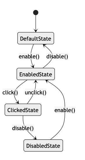
Here is a flow chart of the button states:
Ok, so we’ve done the ‘how-to’ of how to create buttons. Now let’s go a stage further, and look at how we apply buttons to everyday app functions.
The need to use buttons within lists or complex layouts is quite common and natural in any modern UI. Thanfully, with Jetpack Compose, adding buttons to a list is super-easy using the special implementation of the LazyColumn composable, which optimizes it to work with relatively large data sets.
//Example of adding buttons in the Lists.
import androidx.compose.foundation.layout.fillMaxWidth
import androidx.compose.foundation.layout.padding
import androidx.compose.foundation.lazy.LazyColumn
import androidx.compose.foundation.lazy.items
import androidx.compose.material.Button
import androidx.compose.material.Text
import androidx.compose.runtime.Composable
import androidx.compose.ui.Modifier
import androidx.compose.ui.unit.dp
import androidx.compose.ui.tooling.preview.Preview

data class ListItem(val id: Int, val label: String)

@Composable
fun ButtonList(items: List<ListItem>) {
    LazyColumn(modifier = Modifier.fillMaxWidth()) {
        items(items) { item ->
            Button(
                onClick = { /* Handle the button action */ },
                modifier = Modifier
                    .fillMaxWidth()
                    .padding(8.dp)
            ) {
                Text(item.label)
            }
        }
    }
}

@Preview(showBackground = true)
@Composable
fun PreviewButtonList() {
    val sampleItems = List(10) { ListItem(it, "Item $it") }
    ButtonList(items = sampleItems)
}
For context:
LazyColumn displays a list of items in an efficient manner.
Button displays each label from the ListItem data class.
ConstraintLayout allows you to create large and complex layouts with something quite flat at their core. The great thing here is thatConstraintLayout extends the entire idea of a constraint layout, from XML to Jetpack.
//Example of ConstraintLayout in buttons.
import androidx.compose.foundation.layout.padding
import androidx.compose.material.Button
import androidx.compose.material.Text
import androidx.compose.runtime.Composable
import androidx.compose.ui.Modifier
import androidx.compose.ui.unit.dp
import androidx.compose.ui.tooling.preview.Preview
import androidx.constraintlayout.compose.ConstraintLayout

@Composable
fun ButtonConstraintLayout() {
    ConstraintLayout(modifier = Modifier.padding(16.dp)) {
        val (button1, button2, button3) = createRefs()

        Button(
            onClick = { /* Handle button clicks */ },
            modifier = Modifier.constrainAs(button1) {
                top.linkTo(parent.top)
                start.linkTo(parent.start)
                end.linkTo(parent.end)
            }
        ) {
            Text("Action 1")
        }

        Button(
            onClick = { /* Handle button click */ },
            modifier = Modifier.constrainAs(button2) {
                top.linkTo(button1.bottom, margin = 16.dp)
                start.linkTo(parent.start)
                end.linkTo(parent.end)
            }
        ) {
            Text("Action 2")
        }

        Button(
            onClick = { /* Handle button click */ },
            modifier = Modifier.constrainAs(button3) {
                top.linkTo(button2.bottom, margin = 16.dp)
                start.linkTo(parent.start)
                end.linkTo(parent.end)
            }
        ) {
            Text("Action 3")
        }
    }
}

@Preview(showBackground = true)
@Composable
fun PreviewButtonConstraintLayout() {
    ButtonConstraintLayout()
}
Anatomy of a compose codebase and best practices
Time for a bit of admin. Because we all love that, right?
Ok, most of us don’t love admin, if we’re honest. But it’s really important when using JetPack Compose. Good admin helps ensure quality and readability – not just of our buttons, but our overall UI.
Here are some tips that have really helped us at Bugfender:
- Modularize Your code: Decompose Your UI components into Smaller Composable ones.
- Use state management wisely: The
Remember&MutableStatecomponents allow you to manage local state in the composables. If you have more complex state management requirements, best to useViewModeland ComposecollectAsState. - Unified CSS syntax and constants:
MaterialThemeand style are great for resuability. Custom button composables will help you ensure consistent styling. - Preview Composables regularly: Layouts can be previewed anywhere between the beta editor or in an emulator, using
@Previewannotations. . This preview guarantees that your composable will look and feel natural inside multiple configurations. - Optimize performance: To pptimize recompositions, use
remember,derivedStateOf. Don’t perform heavy computations in composables for expensive things. Instead, useLaunchedEffectorremember. - Testing:
ComposeTestRulewill be the place where you write tests for your composables, Use UI tests usingEspressofor user behavior simulation.
These best practices are intended to help you maintain a neat and efficient Compose-based codebase, so that your Android applications can be developed more efficiently.
To recap
We’ve covered a lot of ground today, right?
We’ve discussed the details of Button in Jetpack Compose, and we have covered some important parts while taking a deeper look at buttons and how you can create interactive UI with examples of code.
We started with the basics for creating and styling buttons, then we moved onto more complex requirements such as adding icons, displaying a loading indicator, and managing button states programmatically.
We’ve also discussed positioning buttons inside complex layouts with ConstraintLayout and LazyColumn, to ensure your UI is responsive and adaptable to different sizes of screens or orientations.
But really, these examples are just scratching the surface of what Jetpack Compose can do, This piece of kit can transform your entire experience as a dev, so we’d recommend playing around and exploring as much as you can.
Experiment with creating your own custom buttons, learn new animation options and dive into more sophisticated state management solutions. The more you play with Jetpack Compose, the sooner you will get familiar with it and be able to build advanced user interfaces.
We’ll publish more Jetpack Compose tutorials in future. In the meantime, if you have any questions, hit us up. Happy coding!
Expect The Unexpected!
Debug Faster With Bugfender

Sachin Siwal
Sachin is an accomplished iOS developer and seasoned technical manager, combining 12 years of mobile app expertise with a knack for leading and delivering innovative solutions. You can contact him on Linkedin