10 Minutes
SwiftUI Image Explained: Quick Tips for iOS Image Handling
Fix Bugs Faster! Log Collection Made Easy
From regular buttons, to tab bar elements, even to our SwiftUI app’s icon, Images are a very important aspect of every mobile device application. In this article we’ll look at how to show images in SwiftUI, and give you several tips, with examples, on how to use those Images in your own apps. In this article any image used was sourced from Pexels, a website that hosts a database of free-to-use and royalty-free images.
Table of Contents
How to show images
The most basic – and important – functionality when working with images, is knowing how they’re shown. The three major ways of showing images are:
- Local Image assets
- Remote Images loaded from a server
- System Images, through SF Symbols
We will now look at all the ways of showing our Image assets.
Local Image Assets
Adding Local Image Assets
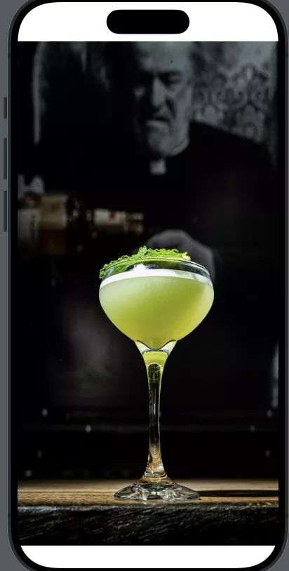
To have local Image Assets we just drag any image to our Assets folder. You can easily locate the Asset folder on your Xcode project by looking for the image placeholder symbol on your project navigator:

Once you open you Assets folder, you can simply drag any image to it. In our case we’ll drag our cocktail image to the Assets folder:
Now our “myImage” is ready to be used throughout our iOS app.
One thing you might notice is that, once you have an asset in your Assets folder, there are places for different versions of your Asset, namely 1x, 2x, and 3x. This has to do with image quality and resolution for different devices. Once our Asset is added to the library, it is treated as an Image Catalog, not as a single image, and those variations help the system optimise what to use for the target devices.
You can read more about which image will be used for each device in their docs, however these are severely outdated. We won’t focus on that, and instead we’ll only have one image on the 1x that will be used for every device.
Showing the Local Image Asset
Now that we’ve added our Image to our Assets, we can finally work with it in our code and show it in our apps. The simplest SwiftUI Image View you can have that shows an image will look like this:
struct ContentView: View {
    var body: some View {
        Image("myImage")
    }
}

#Preview {
    ContentView()
}
As simple as it gets, right?
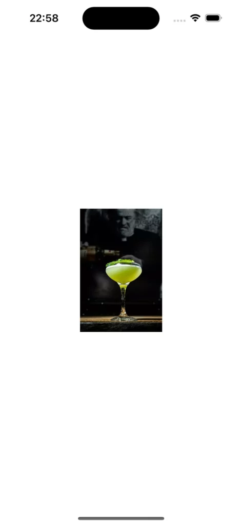
However if you look at that View now it doesn’t look anything like our image:
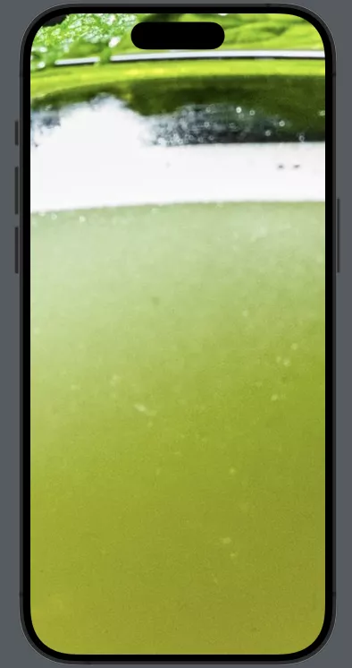

This is due to the resolution of the image, which is 3648 × 5472, making it obviously much bigger that the device itself. We will look into how we can resize the SwiftUI Image and configure it after we see how to load Images from remote sources.
Remote Images loaded from a server
In our apps we very often need to load resources and show them to our users. In SwiftUI this can be done with an AsyncImage view. We simply need to give the AsyncImage a URL and it will try to load the remote image present there. We’ll use the following URL to load our example image: https://images.pexels.com/photos/23105843/pexels-photo-23105843/free-photo-of-lighthouse-in-biarritz-france.jpeg
Now, like before, let us look into the simplest possible SwiftUI view that remotely loads an image:
struct ContentView: View {

    var body: some View {
        AsyncImage(url: URL(string:   "<https://images.pexels.com/photos/23105843/pexels-photo-23105843/free-photo-of-lighthouse-in-biarritz-france.jpeg>"))
    }
}

#Preview {
    ContentView()
}
The result from this simple SwiftUI view is very similar to what we had previously:
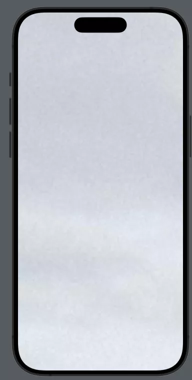

Once again our View only shows a fraction of the image – but don’t worry, we will soon address how to configure Images to our liking.
System Images (SF Symbols)
We can also show SF Symbols as our images. The SF Symbol library is huge, and that allows us to use a vast amount of high quality, configurable images that are available for us from the system. As the time of writing this article, there are over 6,000 symbols to use, and you can check them out here.
Showing SF Symbols is quite straightforward. It is very similar to how we show a regular image, and we are given an initialiser to work with, allowing us to show them:
Image(systemName: "mySFSymbolName")
By using the systemName initialiser the system will try to find a symbol that matches it. There’s so many that we can’t show them all, so we’ll use a specific one for our article, which is the share button SF Symbol.
If you look into the SF Symbol app, you’ll find out that the share button symbol is called square.and.arrow.up.
Since there’s also a few variations of it, and since we’ll colour it soon, we’ll use one of its variations that will help us look at colouring easily, square.and.arrow.up.circle.fill.
To show it, as we’ve seen, we’ll use the systemName initialiser:
Image(systemName: "square.and.arrow.up.circle.fill")
Unlike the previous ones, this will show us the entire image due to it being a system Image that adapts to every single size.
Configuring our Images
We’ve seen how they’re shown, now let’s see how the main configurations can be used to make our Images fit our needs. First we will look at how we can resize our images – since, as we saw before, the Image gets drawn by default, with its full width and height. The main modifier we need to change how our images look is the resizable modifier.
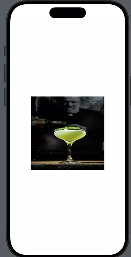
If we go back to the previously shown image and add a resizable to it, this is what happens:
Image("myImage").resizable()
It went from such a large image that didn’t fit our screen at all, to an image that fits the screen perfectly.
Now that we’re aware that we need .resizable() to configure our Images, we can look into other important modifiers.
Changing Frames
One of the most important aspects of configuring our images, is defining their sizes. This can be done by changing the Frames of our images with the simple view modifier .frame. We can grab the previously shown image and add a frame to it:
Image("myImage")
   .resizable()
   .frame(width: 250, height: 250)
With this we can see that our Image respects the new frame instead of occupying the whole screen. As a side effect it adapted to the frame by stretching to the sides. Now let’s look at how to solve this by fitting.
Fitting Images
How they fit their frame is one of the most important details of our Images. While on regular UIImages we have a vast amount of ways to fit images in our Views, on SwiftUI Images has been simplified so that we only have two types of fitting:
- fit – That will fit our image to the parent, maintaining the original aspect ratio.
- fill – That will expand our image to fill out the parent horizontally and vertically, which means that in the vast majority of scenarios it will be out-of bounds in one of those dimensions.
Let’s now look at an example of each
Fit
Having an Image fitting the parent is as simple as having the contentMode set for the aspectRatio.
Image("myImage")
    .resizable()
    .aspectRatio(contentMode: .fit)
    .frame(width: 200, height: 200)
Even if our Image has a frame of 200×200, which would be square, our image will maintain the original aspect ration and decrease its size until it fits the parent.
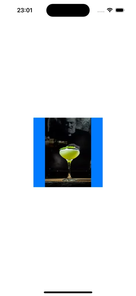
We can look at the entire size of our parent by colouring it to be sure:
Image("myImage")
    .resizable()
    .aspectRatio(contentMode: .fit)
    .frame(width: 200, height: 200)
    .background(Color.blue)
This allows us to check the entire size of our parent which, as expected, is way bigger than our original image.
Fill
Now that we’ve seen our Fit works, let’s look at the other option to fill our images:
Image("myImage")
    .resizable()
    .aspectRatio(contentMode: .fill)
    .frame(width: 200, height: 200)
The image kept its aspect ratio and it is showing beautifully. However, isn’t it odd that our 200×200 frame suddenly seems much bigger?
The reason is that fill will increase the size of our image until it is either the same height, or the same width, of the frame, whatever comes last, to guarantee that both are respected. So in this case, since the image is rectangular, it will increase in width and height, until it is filled up horizontally.

Since it does, however, draw whatever’s on the image, regardless of the parent’s bounds, we can still see it fully.
To respect our frame size, we need to make sure the View does not draw anything outside its bounds, which can be achieved by adding the .clipped modifier to our Image:
Image("myImage")
    .resizable()
    .aspectRatio(contentMode: .fill)
    .frame(width: 200, height: 200)
    .clipped()
Our image is now way smaller, and square, since it now respects the bounds of the frame we’re giving it.

While we have used .aspectRatio(contentMode: this is interchangeable with .scaledToFill() and .scaledToFit() modifiers, and they do exactly the same. Which you should use comes down to personal preference.
Configuration of Remote Images
While all modifiers we’ve looked at work the same for Remote loaded images using AsyncImage, like we saw on the previous chapter, AsyncImage itself does not support adding those modifiers directly. We will need to add an Image block and configure the image there. For comparison, here’s how you’d configure that last example on an AsyncImage:
    AsyncImage(url:URL(string:   "<https://images.pexels.com/photos/23105843/pexels-photo-23105843/free-photo-of-lighthouse-in-biarritz-france.jpeg>"))
        {
            image in
            image.image?.resizable()
                .aspectRatio(contentMode: .fill)
                .frame(width: 200, height: 200)
                .clipped()
        }
The end result would be the same, but we need to access the Image on that block.
Making our Images accessible
As a good practice, to make our apps as accessible as possible – and to help users who need to use e-readers – we should add accessibility labels to our Images. This is done by simply adding a label to our Image, and that label should explain what the image is so that the person using the e-reader can understand it. For our example Image this could be:
Image("myImage", label: "Full Cocktail Glass")
It’s a quick and easy thing for developers to include, and since it can help your users, it’s good practice to try doing it yourself.
Summing up
Images are an integral part of developing iOS apps.
We’ve looked at how to show custom images, images loaded from a server, and even system images.
Then we looked at configuring those images to fit our app’s needs, and we finished up reminding you that accessibility should also be taken into account when adding images to your app.
We hope this article has helped with understanding the mechanics of using image assets in your apps.
Expect The Unexpected!
Debug Faster With Bugfender