
6 Minutes
SwiftUI Colors: Tips and Best Practices for Developers
Fix Bugs Faster! Log Collection Made Easy
It might be a cliche, but first impressions really do count. Whether it’s a first date, a job interview or the UI design of your app, looking the part is a massively important consideration. Today we’re going to look at how we can use the SwiftUI Color structure to enhance the visual appeal of our apps and make the right impression on our users.
We’ll start with a look at the built-in system colors and how custom colors can be added, as well as using color assets to support light and dark mode. Then we’ll consider how we can design a simple system to allow users to set their own color preferences.
Let’s get started!
System colors
Swift standard library comes with the Color type which includes a variety of built-in system colors we can use in our UI design. These are:
- primary
- secondary
- teal
- orange
- green
- yellow
- clear
- pink
- gray
- white
- mint
- black
- blue
- indigo
- brown
- red
- cyan
- purple
To apply a color we simple use the Color operator, as below:
Color.red
We can adjust the opacity of a color by using a Float, with 0.0 meaning completely translucent, and 1.0 meaning solid. We’d set the opacity with the following modifier:
Color.red.opacity(0.5)
Custom colors
In addition to the built-in colors, we can also create custom colors and there are four main ways to do this:
- Using
RGBAvalues, where thealphacan be omitted and will have a default value of 1. Like this:let myColor = Color(red: 0.5, green: 0.5, blue: 0.5, alpha: 0.5) - Using
HUE,Saturation,Brightness, andOpacity, like this:
let myDarkRed = Color(hue: 1.0, saturation: 1.0, brightness: 0.6, opacity: 0.8)
- From a
UIColor(useful for projects not using SwiftUI so didn’t haveColor), like this:let myColorFromUIColor = Color(uiColor: myUIColor) - From a
CGColor, (useful for older projects that had plenty of colors already set withCGColors), like this:let myColorFromCGColor = Color(cgColor: myCGColor)
Using Extensions to support custom colors
Like most things in Swift, we can use [Extensions](<https://bugfender.com/blog/swit-extensions/>) to extend a Color and add customised colors to it. The best way to do so is by adding a static computed property to the extension, as shown below:
extension Color {
    static var myDarkRed: Color {
        return Color(hue: 1.0, saturation: 1.0, brightness: 0.6, opacity: 0.8)
    }
}
Now Color can support a new custom color in addition to the default built-in colors, and we can use it like this:
Color.myDarkRed
Color assets
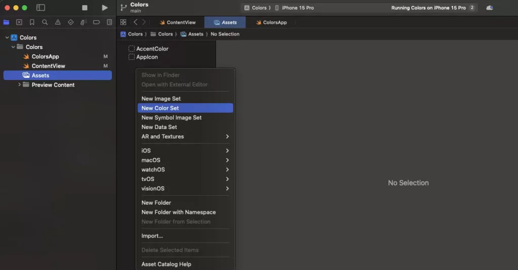
We can also define Color Assets in the asset catalog and use them in our SwiftUI views. To create a color asset, we simply go to an Assets file, right-click, and choose New Color Set, as follows:
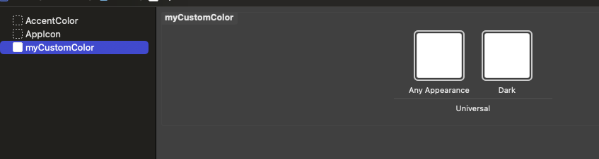
Now we have two different variations of our custom color and can support light and dark mode if needed:
Once we’ve created our custom color set it’s really simple to deploy, as shown below:
Color(.myCustom)
The right version for light mode or dark mode will be selected automatically, which makes things much more straightforward.
Custom color schemes
A great way to keep color management in our apps as simple and consistent as possible is by defining our own custom color scheme. We can then deploy the scheme across the whole app, ensuring consistency and making updating or changing colors much simpler and quicker.
A simple example of how we’d use a color scheme would be with the following struct:
struct MyColorScheme {
    static let background = Color.gray
    static let text = Color.red
    static let buttonBackground = Color.teal
    static let border = Color.black
}
Any of our views could now be colored in accordance with that scheme, and if we wanted to change the colors on the scheme, changing them in one place would be reflected all over our app.
Colors of UI elements
We can use several modifiers to update UI elements, depending on which element or SwiftUI view we want to color. Below are examples of different elements that we might want to change the colors of:
        VStack {
            Text("Hello, world!").foregroundStyle(MyColorScheme.text)
            Button(action: {},
				           label: {
							         Text("ok")
				            }
				    )
				    .background(MyColorScheme.buttonBackground)
				    .foregroundStyle(MyColorScheme.text)
        }
        .padding()
        .border(MyColorScheme.border)
- Both
TextandButton’stext is colored with theforegroundStylemodifier - The button background color is set with its
backgroundmodifier - The border we’re adding to the
VStackis colored from its ownbordermodifier.
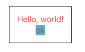
The final result of that view would be:
It’s worth noting that we could have also used foregroundColor to set the color of the text elements, like this:
Text("Hello, world!").foregroundColor(MyColorScheme.text)
However, as foregroundColorwould be superseded and replaced by foregroundStyle, it makes sense to use the latter from the start to set the foreground style which includes the foreground color and text color if the SwiftUI component has text.
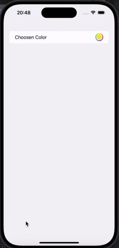
Using Color Picker for user selected colors
A more recent addition to iOS pickers, Color Picker allows us to enable users to personalise their experience by choosing from a palette of colors. It’s very simple to declare and use, and provides users with a seamless experience:
@State private var bgColor = Color(
    .sRGB,
    red: 0.98,
    green: 0.9,
    blue: 0.2)

 var body: some View {
   List {
     ColorPicker("Choosen Color",
                  selection: $bgColor)
   }
 }
To sum up
In SwiftUI, colors are used extensively to style and design user interfaces. SwiftUI provides a Color structure that represents a color and can be used in various ways to apply color to views, backgrounds, and other UI elements.
We’ve looked at how to use the built-in system colors as well as create our own custom colors. We’ve also looked at using Extensions to support custom colors and defining Color Assets in the asset catalog to use them in our SwiftUI views.
Finally we looked at how we’d color individual UI elements, as well as how we can allow users to set their own color preferences using Color Picker.
Hopefully you now feel confident to experiment with colors in your own Swift projects.
Expect The Unexpected!
Debug Faster With Bugfender