
37 Minutes
The iOS Developer’s Playbook: Mastering SwiftUI Forms
Fix Bugs Faster! Log Collection Made Easy
In this article we’re going to examine how a SwiftUI Form can used in our SwiftUI apps. This will be a very technical article useful for any iOS developer, during which we’ll take a deep-dive into the code and then create a SwiftUI Form that combines a user profile with a settings screen.
Table of Contents
But first – what are SwiftUI Forms?
Forms, in SwiftUI, are scrolling lists of static content. They’re a great asset to include in our UI arsenal as they work well in three specific scenarios:
- Data request screens for users.
- Settings screens.
- User profiles.
In these situations we usually know the exact number of items we want, so forms provide a simple go-to solution.
In addition, they can implement platform-specific styling of the views inside them, which makes it easy to create native-looking Forms in any of our Apple platforms while sharing a code base.
The limitations of SwiftUI Forms
One limitation of Forms is the amount of children Views they can include, which is fixed at 10. However, we can get around this limit by using Sections or Groups. Here are some of the differences between them:
Group
Groups separate the logic on a SwiftUI Form, which means that a Group won’t change anything in our UI at all. They’re great for grouping our views, although that’s pretty much all they’re good for.
Section
Just like Groups, a section view enable us to separate our form fields, but that’s not all. They also enable us to group our Views visually, and provide default support for a Title, which is very useful – as we’ll see shortly.
Building our SwiftUI Forms demo project
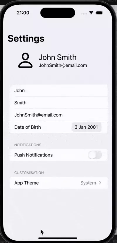
Like any aspect of programming, the best way to understand how SwiftUI forms work is to see them in action. So now we’re going to build the following app.
In the first Section, we will allow the user to select their profile picture from a list of options in the gallery, and to edit personal information.
As mentioned earlier, it’s a combination of a user profile and settings screen.
In the second Section, entitled Notifications, we will use a Toggle to enable/disable Notifications, and then a Stepper to choose the amount of notifications the user will receive.
In the third and final Section, we will simply have a Picker that enables the user to change the default Theme on the app.
Exciting, right? Ok, let’s start coding.
Creating the first section – user info
Since we already know what we want to achieve, now let’s look at the journey to get there and learn how to use SwiftUI forms in your SwiftUI projects. We can begin by creating an empty SwiftUI View for our SwiftUI app.
We’ll call it Forms, and this is how it looks by default:
import SwiftUI

struct Forms: View {
    var body: some View {
        Text("Hello, World!")
    }
}

#Preview {
    Forms()
}
We’ll delete what’s inside the body, and add the basis of our basic form. We already know the properties we’ll need for the first Section’s user info – the first name, the last name, and the email. They’ll need to be @State variables since we need them to be modified, and since we’re working inside a Struct, which is non-modifiable, by default.
We won’t add the profile picture just yet – we’ll do that in a later step. So, now, our form view looks as follows:
struct Forms: View {
    @State private var firstname: String = "John"
    @State private var lastname: String = "Smith"
    @State private var email: String = "[email protected]"

    var body: some View {
        Form {
            Section {
                TextField("First name", text: $firstname)
                TextField("Last name", text: $lastname)
                TextField("Email", text: $email)
            }
        }
    }
}
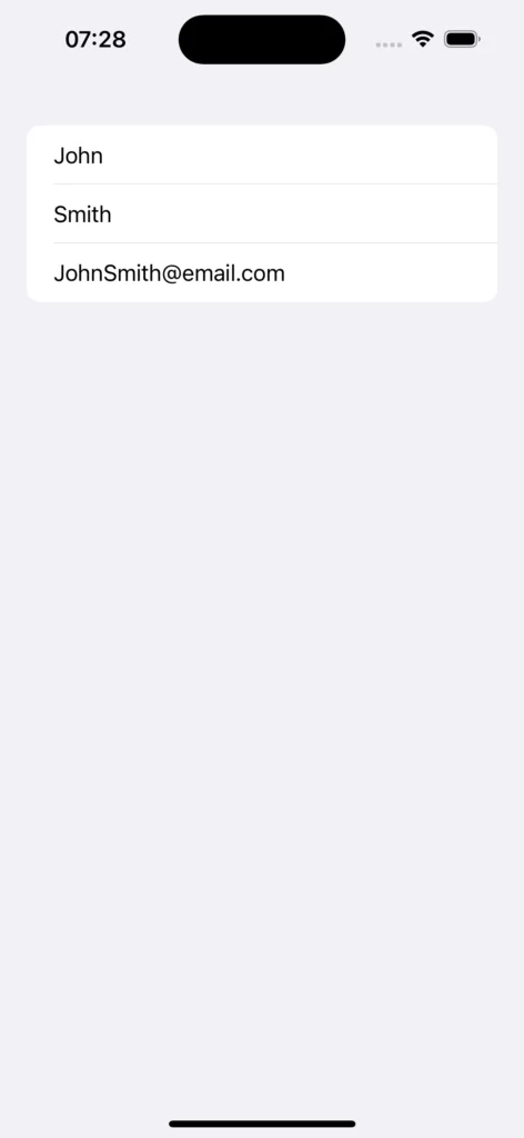
It’s a start! Now, we can see how easy it is to create a simple Form with three fields (in this case three fields of type Text Field), which will serve as user input.
So let’s go a stage further and add a DatePicker, which will enable the user to choose their birthdate. in an easier way than doing it on a text input.
For the DatePicker we need an extra @State property to serve as the initial date and provide the place where our changed Date is stored. The initial Date will be January 1, 2001, which is Swift’s Reference Date:
@State var date = Date(timeIntervalSinceReferenceDate: 0)
Now that we have this initial Date, we can create our DatePicker:
DatePicker("Date of Birth", selection: $date)
If we add both elements to our Section, this is how everything looks:
struct Forms: View {
    @State private var firstname: String = "John"
    @State private var lastname: String = "Smith"
    @State private var email: String = "[email protected]"
    @State var date = Date(timeIntervalSinceReferenceDate: 0)

    var body: some View {
        Form {
            Section {
                TextField("First name", text: $firstname)
                TextField("Last name", text: $lastname)
                TextField("Email", text: $email)
                DatePicker("Date of Birth", selection: $date)
            }
        }
    }
}
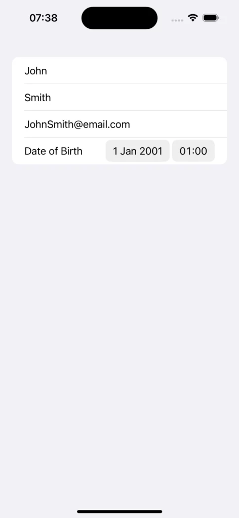
While it looks good, and allows us to choose a Date, it also helps us choose a different time. This seems unnecessary for our demo project, so let’s make only the Date component available.
We can achieve this by changing our DatePicker declaration to resemble the following:
DatePicker("Date of Birth", selection: $date, displayedComponents: .date)
Now only the Date component will be shown… but not the time selector, as we intended.
To complete the first Section, we simply need the header that contains the user’s Profile Picture, and then both the user’s name and email. So let’s work on that.
We will need three @State properties for the functionality of picking the user’s image:
- One
Imageto store the picked image itself. - A
PickerItem, a property that will enable us to transfer the images from the gallery. - A
booleanthat will let us know whether to show the image picker or not.
  @State private var avatarItem: PhotosPickerItem?
  @State private var avatarImage: Image?
  @State private var shouldPresentPhotoPicker: Bool = false
As for the UI, taking advantage of SwiftUI framework and the components it provides, we will use:
- A
Buttonwhich will serve as the avatar and can be tapped to open the SwiftUIPicker. - An
Imagefor the unselected avatar, for which we’ll use anSF Symbol. - Two
Textview fields, which will show the user’s name and email. HStacksandVStacks, to hold all our views in groups and in their respective places.
So let’s do it step by step. First we have the HStack and the VStacks, since those are the parent views which will contain the others:
HStack{
  VStack {
	}
	VStack {
	}
}
Now, since the user’s name and email address are very simple data, we can add those right away using a text view:
HStack{
  VStack {
	}
	VStack {
		Text(firstname + " " + lastname)
       .font(.title)
       .frame(maxWidth: .infinity,
              alignment: .leading)

	   Text(email)
        .frame(maxWidth: .infinity,
               alignment: .leading)
	}
}
Let’s add on our first VStack to our view hierarchy, the default when no avatar is selected:
HStack{
  VStack {
		Image(systemName: "person").font(.system(size: 60, weight: .medium))
	}
	VStack {
		Text(firstname + " " + lastname)
       .font(.title)
       .frame(maxWidth: .infinity,
              alignment: .leading)

	   Text(email)
        .frame(maxWidth: .infinity,
               alignment: .leading)
	}
}
While this serves as a good example, we want to build upon it, adding some nice functionality and showing you how to use the PhotosPicker.
So, next, we wrap our Image in a SwiftUI Button. A single tap of that button will change the boolean that will control the visibility of the PhotoPicker:
Button(action: {
    shouldPresentPhotoPicker = true;
}, label: {
   Image(systemName: "person").font(.system(size: 60, weight: .medium))
})
Changing the Boolean won’t do anything for now, because we have no PhotoPicker to show yet. But we can change that:
import PhotosUI //on top of our file
...

Button(action: {
    shouldPresentPhotoPicker = true;
}, label: {
   Image(systemName: "person").font(.system(size: 60, weight: .medium))
})
.photosPicker(isPresented: $shouldPresentPhotoPicker,
		selection: $avatarItem)
Yep, it’s as simple as that! The Picker will show as soon as we add that line. However, let’s not get carried away, because it won’t do anything.
For the Picker to fulfil its desired functions, we need to observe the picking of a photo and react accordingly. To achieve this function, we will add this code to the end of our VStack:
.onChange(of: avatarItem) {
    Task {
      if let loaded = try? await avatarItem?.loadTransferable(type: Image.self) {
         avatarImage = loaded
	     } else {
         print("Failed")
	     }
   }
}
The onChange() Task will observe its children, and where the Picker is. When the avatarItem changes, it will attempt, and succeed, to create an image, and use this new image as our AvatarImage.
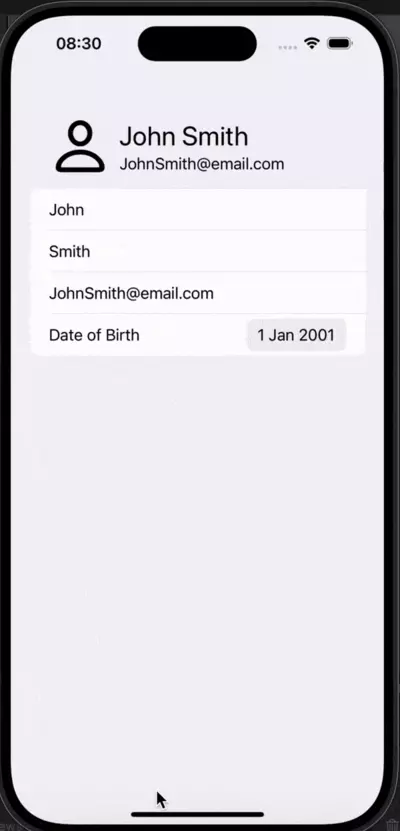
Now let’s run the code and see how it looks:
While things are starting to look good, a few snags are still noticeable:
- The default avatar image color is blue, instead of black like the remaining elements.
- When we select a picture, nothing changes.
- The header itself has a white background instead of just being the same colour as the form’s background.
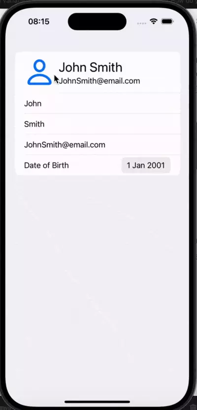
So let’s fix those problems.
For the avatar image color, we simply need to change the tint of the Button by adding a tint modifier, as follows:
.tint(.black)
The selected image will never change, since we are only displaying the default avatar image. However, we can change this by adding a condition that will check whether an image has been selected, and will only display a default image if none has been chosen.
We wrap our image with an if clause, and then return a different view. The following example will return the, if it exists, our previously declared avatar image, otherwise it will return a default image:
if(avatarImage == nil) {
  Image(systemName: "person")
		.font(.system(size: 60, weight: .medium))
} else {
  avatarImage?
	  .resizable()
	  .frame(width: 80, height: 80)
	  .aspectRatio(contentMode: .fit)
}
The last of the issues we mentioned is the header’s background: we want to ensure this is the same as the Form’s. Again, however, the answer is simple. We simply need to add HStackto our outer :
.listRowBackground(Color(UIColor.systemGroupedBackground))
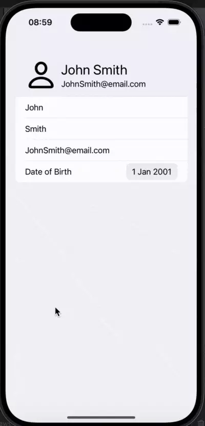
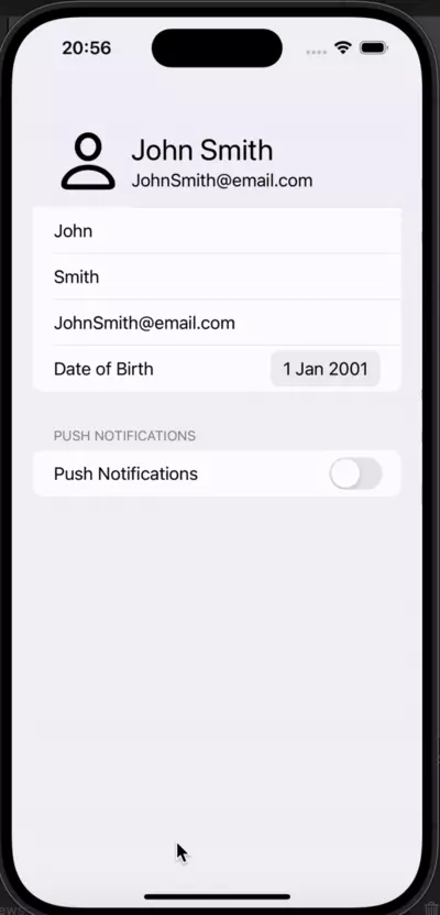
Let’s run it and see how it looks:
Nearly there! We simply need to add a Corner Radius to our image:
.cornerRadius(40)
And this is how our app currently looks with our already completed Section:
import SwiftUI
import PhotosUI

struct Forms: View {
    @State private var firstname: String = "John"
    @State private var lastname: String = "Smith"
    @State private var email: String = "[email protected]"
    @State var date = Date(timeIntervalSinceReferenceDate: 0)

    @State private var avatarItem: PhotosPickerItem?
    @State private var avatarImage: Image?
    @State private var shouldPresentPhotoPicker: Bool = false

    var body: some View {
        Form {
            Section {
                HStack{
                  VStack {
                      Button(action: {
                          shouldPresentPhotoPicker = true;
                      }, label: {
                          if(avatarImage == nil) {
                            Image(systemName: "person").font(.system(size: 60, weight: .medium))
                          } else {
                            avatarImage?
                             .resizable()
                            .frame(width: 80, height: 80)
                            .aspectRatio(contentMode: .fit)
                            .cornerRadius(40)

                          }
                      })
                      .tint(.black)
                      .photosPicker(isPresented: $shouldPresentPhotoPicker,
                              selection: $avatarItem)                    }.onChange(of: avatarItem) {
                        Task {
                            if let loaded = try? await avatarItem?.loadTransferable(type: Image.self) {
                                avatarImage = loaded
                            } else {
                                print("Failed")
                            }
                        }
                    }

                    VStack {
                        Text(firstname + " " + lastname)
                       .font(.title)
                       .frame(maxWidth: .infinity,
                              alignment: .leading)

                       Text(email)
                        .frame(maxWidth: .infinity,
                               alignment: .leading)
                    }
                }.listRowBackground(Color(UIColor.systemGroupedBackground))

                TextField("First name", text: $firstname)
                TextField("Last name", text: $lastname)
                TextField("Email", text: $email)
                DatePicker("Date of Birth", selection: $date, displayedComponents: .date)
            }
        }
    }
}

#Preview {
    Forms()
}
This looks exactly as we wanted it to look.
Now that the first, and by far the biggest, Section is done, let’s advance to the missing two, so that our project is complete, as shown in the beginning of the article.
Creating the second section – push notifications
Now that we’ve completed the editable section that contains user information, we can start working on the section dedicated to configuration.
We thought that Push Notifications, which are really common in iOS apps, would provide a good example of this. In practice, however, our section won’t really activate/deactivate the notifications.
So we’ll build a using interface using a toggle, and a stepper, that can be used in a real project. Just plug in similar logic to your real View Model and you can make it work.
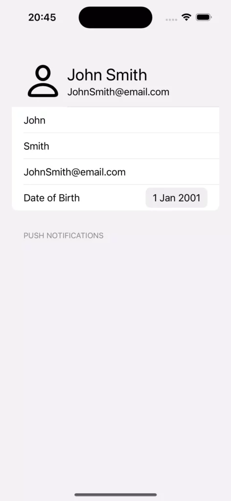
Now let’s get our hands on it. To kick things off, we’ll add a simple Section with a title below our previous Section. This is unlike the previous section that we made, which had no title at all.
Section("Notifications") {

}
This section will add a simple Title to our View:
Now that we have the Section itself in place, and we’ve seen how the title looks, let’s add two elements to it:
- A
Togglethat will enable/disablePush Notifications. - A
Stepperthat will allow us to configure the number ofNotificationswe’re willing to receive.
Note: As mentioned previously, this won’t add any actual functionality. In a real-world scenario, you will simply need to add Logic to tell your backend about those changes and then the Backend would react to them.
We also need a couple of @State variables to go with both elements, a Boolean to know when our Toggle is on or off, and an Int to store the amount of Notifications.
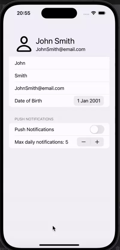
This is how our Section will look after adding both elements:
@State private var maxNotifications: Int = 5
@State private var enablePush: Bool = false
...

Section("Notifications") {

	Toggle(isOn: $enablePush) {
	  Text("Push Notifications")
	}

	Stepper("Max daily notifications: \\(maxNotifications)",
				value: $maxNotifications, in: 0...10)
}
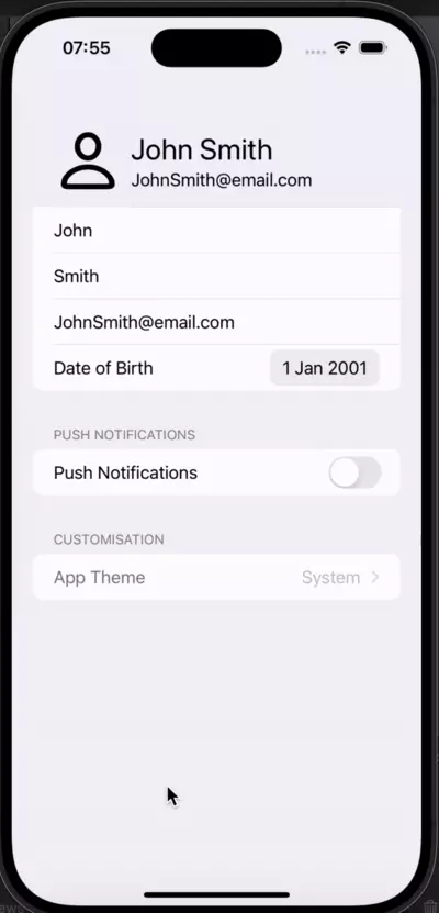
And this is the visual result:
While it looks great, we may want to prevent the user from changing the Stepper values when notifications are toggled off. If this is the case, let’s hide the Stepper altogether.
To do this, we’ll have the Stepper work as a conditional View. This means we’ll have a condition that controls whether the Stepper displays or not. In fact, we already have a Boolean variable to use for this very purpose:
@State private var maxNotifications: Int = 5
@State private var enablePush: Bool = false
...

Section("Notifications") {

	Toggle(isOn: $enablePush) {
	  Text("Push Notifications")
	}
  if(enablePush) {
		Stepper("Max daily notifications: \\(maxNotifications)",
					value: $maxNotifications, in: 0...10)
	}
}
And now we have the final result:
Creating the third section – customization
To put the finishing touches to this article, let’s add a feature that’s common to many apps: A way for the user to customize the UI which can improve the user experience of our iOS app. In our version, we will allow the user to change the default app’s theme from light to dark, overriding system preferences.
This will be a short section, so let’s go at it by adding the three necessary variables and the Picker we’ll use to pick the Theme.
let themeOptions = [
        ThemeOptions.system.rawValue,
        ThemeOptions.dark.rawValue,
        ThemeOptions.light.rawValue
    ]

@State private var theme: String = ThemeOptions.system.rawValue

@State var globalScheme: ColorScheme = .light

...

Section("Customisation") {
   Picker("App Theme",
          selection: $theme) {
          ForEach(themeOptions, id: \\.self) { t in
             Text(t.description.capitalized).tag(t)
           }
   }
}
This builds our UI, but it isn’t doing anything yet. We’re not reacting to the theme change, simply saving it in the @State variable theme.
So let’s add a way to observe the change. We’re also going to change our Picker Style, because a Navigation Style Picker looks better for this particular functionality. We can achieve both ends by adding the following modifiers to our Picker:
.pickerStyle(.navigationLink)
.onChange(of: theme) {
   switch theme {
       case ThemeOptions.dark.rawValue:
		        globalScheme = .dark
        case ThemeOptions.light.rawValue:
             globalScheme = .light
        default:
              globalScheme = .dark
    }
}
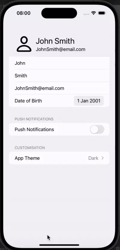
Now, if we run the code, this is what we get.
While it looks close to what we were aiming for, it isn’t functional. Tapping/clicking on the Picker does not take us to the selection page, so our navigation is not working as expected.
But why is this? Well, if you remember Pickers .navigationLink has an extra requirement. Unlike other Pickers, which only need to be wrapped inside a Form or List. it needs to be wrapped inside a NavigationStack.
This means that we need to wrap our whole Form in a NavigationStack:
var body: some View {
        NavigationStack {
            Form {
...

	}
}
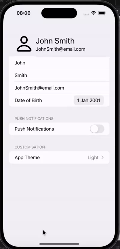
Ok, let’s try that again:
So now our app is changing the entire selection, just not the colors. This is because we’re never actually telling the whole View, or in this case the NavigationStack, that it should use the previously added colorScheme colors for its children.
In fact, we have to add a modifier to the closing brackets we’ve just added for our NavigationStack:
NavigationStack {
...
}
.preferredColorScheme(globalScheme)
As we can now see, the colors are changing and we’re very, very close to achieving total functionality for our demo project, as we wanted
We do, however, notice two issues:
- When we change the colors the empty avatar hides, which is due to the fact that it is dark by default.
- None of the page titles turns into a navigation title when we scroll, although this is usual on the actual settings app.
To fix both these issues, we need to add two things. First, a conditional that will change the color of the avatar placeholder depending on the chosen scheme, and secondly, a NavigationTitle modifier that will be added to our Form. So, let’s start adding:
Form {
	...
	~~.tint(.black)~~
	//We're replacing our .black tint, with the following ternary:
	.tint(globalScheme == ColorScheme.light ? .black : .white)
	...
}.navigationTitle(Text("Settings"))
//This is added to the closing brackets of the Form itself
And here we have our finished project:
You can find it here on Github if you’d like to look at it on Xcode. Otherwise, here’s the code for the full Project that we’ve just made:
import SwiftUI
import PhotosUI

struct Forms: View {
    @State private var firstname: String = "John"
    @State private var lastname: String = "Smith"
    @State private var email: String = "[email protected]"
    @State var date = Date(timeIntervalSinceReferenceDate: 0)

    @State private var avatarItem: PhotosPickerItem?
    @State private var avatarImage: Image?
    @State private var shouldPresentPhotoPicker: Bool = false

    @State private var maxNotifications: Int = 5
    @State private var enablePush: Bool = false

    let themeOptions = [
        ThemeOptions.system.rawValue,
        ThemeOptions.dark.rawValue,
        ThemeOptions.light.rawValue
    ]

    @State private var theme: String = ThemeOptions.system.rawValue
    @State var globalScheme: ColorScheme = .light

    var body: some View {
        NavigationStack {
            Form {
                    Section {
                        HStack{
                            VStack {
                                Button(action: {
                                    shouldPresentPhotoPicker = true;
                                }, label: {
                                    if(avatarImage == nil) {
                                        Image(systemName: "person").font(.system(size: 60, weight: .medium))
                                    } else {
                                        avatarImage?
                                            .resizable()
                                            .frame(width: 80, height: 80)
                                            .aspectRatio(contentMode: .fit)
                                            .cornerRadius(40)

                                    }
                                })
                                .tint(globalScheme == ColorScheme.light ? .black : .white)
                                .photosPicker(isPresented: $shouldPresentPhotoPicker,
                                              selection: $avatarItem)                    }.onChange(of: avatarItem) {
                                    Task {
                                        if let loaded = try? await avatarItem?.loadTransferable(type: Image.self) {
                                            avatarImage = loaded
                                        } else {
                                            print("Failed")
                                        }
                                    }
                                }

                            VStack {
                                Text(firstname + " " + lastname)
                                    .font(.title)
                                    .frame(maxWidth: .infinity,
                                           alignment: .leading)

                                Text(email)
                                    .frame(maxWidth: .infinity,
                                           alignment: .leading)
                            }
                        }.listRowBackground(Color(UIColor.systemGroupedBackground))

                        TextField("First name", text: $firstname)
                        TextField("Last name", text: $lastname)
                        TextField("Email", text: $email)
                        DatePicker("Date of Birth", selection: $date, displayedComponents: .date)
                    }
                    Section("Push Notifications") {
                        Toggle(isOn: $enablePush) {
                            Text("Push Notifications")
                        }
                        if(enablePush) {
                            Stepper("Max daily notifications: \\(maxNotifications)", value: $maxNotifications, in: 0...10)
                        }
                    }
                    Section("Customisation") {
                        Picker("App Theme",
                               selection: $theme) {
                            ForEach(themeOptions, id: \\.self) { t in
                                Text(t.description.capitalized).tag(t)

                            }
                        }.pickerStyle(.navigationLink)
                            .onChange(of: theme) {

                                switch theme {
                                case ThemeOptions.dark.rawValue:
                                    globalScheme = .dark
                                case ThemeOptions.light.rawValue:
                                    globalScheme = .light
                                default:
                                    globalScheme = .dark
                                }
                            }

                    }
            }
            .navigationTitle(Text("Settings"))

        }
        .preferredColorScheme(globalScheme)
    }
}

#Preview {
    Forms()
}
To sum up
We’ve had a look at Forms using SwiftUI. We’ve seen how they’re declared and used, and how we can include custom elements, and input controls, in them. We’ve also seen how we can have conditional views, how we can change our app’s theme, and how can we select pictures from a user’s photo library to use in our apps.
Hopefully this will help you understand use cases in which you can use your own Forms, how to configure them, and how to take advantage of them. Happy coding!
Expect The Unexpected!
Debug Faster With Bugfender