
14 Minutes
Understanding SwiftUI Pickers: Usage and Styling Techniques
Fix Bugs Faster! Log Collection Made Easy
Introduction
Pickers are UI elements, provided by SwiftUI, that enable our users to choose between multiple options while using our iOS app. In this article we’ll have a look at them to see the various types and explore how they’re declared, configured, and styled. Together with SwiftUI buttons, pickers are one of the most used UI elements in iOS apps.
Types of SwiftUI Pickers
There are several types of SwiftUI Pickers available to us: the regular, and more configurable Pickers, and the specialised DatePicker and ColorPicker. We will now look into all of them, and their sub-variants, to see how they look and can be used and how can we change the picker style.
- Regular Picker View: A basic selection interface for choosing from a list of options.
- DatePicker View: Specialized for selecting dates and times.
- ColorPicker View: Enables users to choose colors from a visual palette.
Table of Contents
- Introduction
- SwiftUI Picker View
- SwiftUI Date Picker
- SwiftUI Color Picker
- SwiftUI Picker FAQ
- What is a SwiftUI Picker?
- How do I create a Picker in SwiftUI?
- Can I customize the style of a SwiftUI Picker?
- How can I set the default value of a SwiftUI Picker?
- Can I make SwiftUI Picker options mutually exclusive?
- How can I change the style of a SwiftUI Picker dynamically?
- Can a SwiftUI Picker display images or symbols?
- To sum up
SwiftUI Picker View
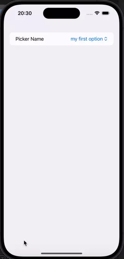
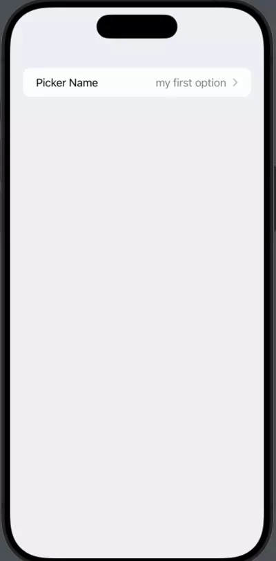
The regular SwiftUI Picker view is the more customizable option, since we can feed it with the custom options we want it to include, usually the options is a collection or array of items. This is what a simple declaration of a regular Picker view could look like:
import SwiftUI

struct ContentView: View {
    @State private var selected: String = ""

    private let selectionOptions = [ //This is the List of values we'll use
        "my first option",
        "my second option",
        "my third option"
    ]

    var body: some View {
        Picker("Picker Name", //This is the picker's title
               selection: $selected, //This is the binding variable
               content: {
            ForEach(selectionOptions, id: \.self) {
                Text($0)
            }
        })
    }
}
There are three main elements to the Picker’s declaration:
- The Title – Which can be a string or a label.
- The Binding Variable – This is where the picker value is stored when it changes.
- The Value List – This is where we’ll find the values that will be shown to the user.
In this example, the selected value will be stored via a binding value to the selected state variable. As you can see in the example, the Picker method has a parameter called content that gets a Swift closure, that’s a block of code that can be passed around.
SwitUI Picker Styles
We can change the default picker style simply by adding the modifier .pickerStyle() to our Picker. Let’s have a look at the available styles and check how they’re shown and used:
Menu Picker
Menu Pickers provide a context menu to choose one time from one of the options. The Menu Picker can be declared by adding the .pickerStyle(.menu) to our Picker. It would look like:
var body: some View {
  List {
    Picker("Picker Name",
      selection: $selected) {
           ForEach(selectionOptions,
                   id: \\.self) {
                      Text($0)
           }
     }.pickerStyle(.menu)
   }
}
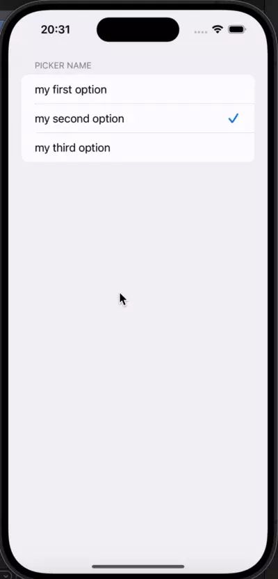
Inline Picker
The Inline Picker is very similar to the Menu Picker we’ve just seen. The main difference is that instead of it being a collapsed list of options that appear when we click the selected item, it is by default a list with all available options. To declare one, we simply need to add the .pickerStyle(.inline) to our Picker.
var body: some View {
  NavigationStack {
    List {
      Picker("Picker Name",
        selection: $selected) {
             ForEach(selectionOptions,
                     id: \\.self) {
                        Text($0)
             }
       }.pickerStyle(.inline)
      }
   }
 }
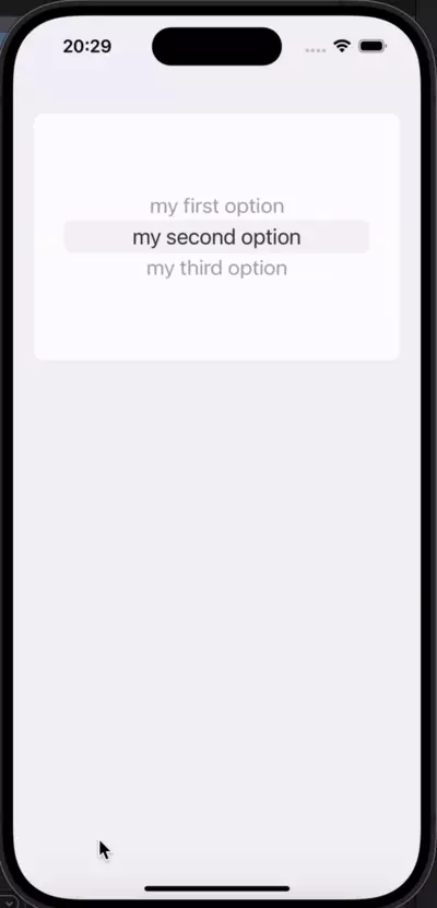
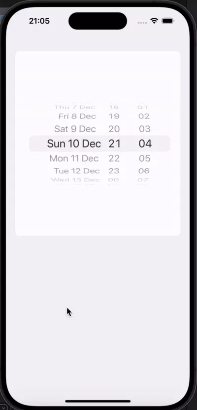
Wheel Picker
Wheel Pickers are the classic wheels in which we have to rotate to select a certain option. They end up being way more compact than Inline Pickers when we have a long list of options, and the obvious selection in those cases. To declare one, we simply need to add the .pickerStyle(.wheel) to our Picker.
var body: some View {
  NavigationStack {
    List {
      Picker("Picker Name",
        selection: $selected) {
             ForEach(selectionOptions,
                     id: \\.self) {
                        Text($0)
             }
       }.pickerStyle(.wheel)
      }
   }
 }
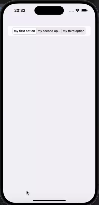
Segmented Picker
Segmented Pickers are shown in a row, usually called Segmented Control in iOS apps .They’re great when we want to subdivide a view based on the selection option and show different elements when a user chooses one of those elements. Again, the declaration process is simple: we merely need to add the .pickerStyle(.segmented) to our Picker.
var body: some View {
  NavigationStack {
    List {
      Picker("Picker Name",
        selection: $selected) {
             ForEach(selectionOptions,
                     id: \\.self) {
                        Text($0)
             }
       }.pickerStyle(.segmented)
      }
   }
 }
Navigation Link Picker
The Navigation Link Picker consists of a single line which, when tapped, takes the user to a new screen with all the options. Once one of the options is selected, it automatically pops to the previous screen while maintaining the selection.
To declare one of these options, we simply need to add the .pickerStyle(.navigationLink) to our Picker.
The biggest difference between Navigation Link, and other Pickers, is that it needs to be contained withn a Navigation Stack, while others merely need to be inside a List or Form.
var body: some View {
  NavigationStack {
    List {
      Picker("Picker Name",
        selection: $selected) {
             ForEach(selectionOptions,
                     id: \\.self) {
                        Text($0)
             }
       }.pickerStyle(.navigationLink)
      }
   }
 }
SwiftUI Date Picker
Date Pickers are specialised types of Pickers that we can use when we need to ask our users to specify Dates.
While we can configure our own custom Picker, with any of the styles we’ve seen previously, to allow us to ask for Dates, these are the default, and the simplest way, to do so. The only exceptions are cases where we have a really custom implementation that requires a specific Picker to be used, we will very likely be using a Date Picker for anything Date-related.
Like the other Pickers, they come bundled with different styles for use in a variety of situations, so let’s dig into them now.
Wheel Date Picker
Wheel Date Pickers are the classical, and most common, way, to let a user pick a date. Use will certainly have dealt with them in the past, so they have the great advantage of familiarity.
Simple to understand, with an obvious use case, they’re the obvious answer when we’re looking for something simple. We configure them using the following date picker style: .datePickerStyle(WheelDatePickerStyle()).
@State private var date = Date.now

 var body: some View {
  List {
    DatePicker("Enter your birthday",
                selection: $date)
			 .datePickerStyle(WheelDatePickerStyle())
       .frame(maxHeight: 400)
       }
 }
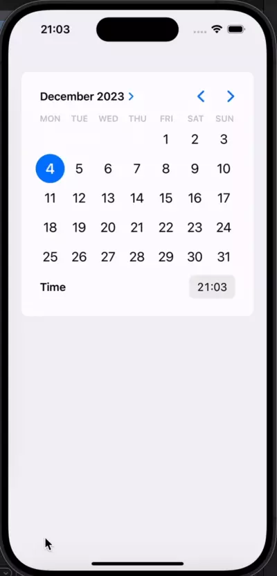
Graphical Date Picker
The Graphical Date Picker is a very convenient way to let our users pick a specific and comprehensive date, from the year right down to the specific minute.
This picker does take up some space by default, but it’s a great option to include in our flows when we want to get granular about a certain date and time.
To use a Graphical Date Picker, we simply need to configure our Picker with .datePickerStyle(GraphicalDatePickerStyle()). They’re the most recent addition to our rooster of Date Picker styles, and were only introduced in iOS 14.
@State private var date = Date.now

 var body: some View {
  List {
    DatePicker("Enter your birthday",
                selection: $date)
			 .datePickerStyle(GraphicalDatePickerStyle())
       .frame(maxHeight: 400)
       }
 }
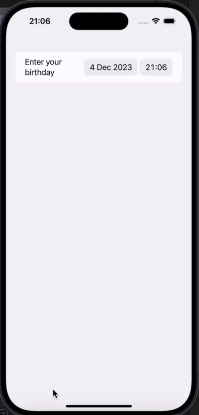
Compact Date Picker
The Compact Date Picker, introduced in the latest versions of iOS 13, specifically 13.4, is the predecessor to the Graphical Date style we saw just above. Just like the Graphical, it gives us control over date and time and can be used when we don’t want to use as much UI real estate to present the Picker to the user.
When the user selects one of the components, which will be either date or time, the app displays a small context popup and allows the user to specify the exact date/time. Like the previous examples, it can be used by adding .datePickerStyle(CompactDatePickerStyle()) to our Picker.
@State private var date = Date.now

 var body: some View {
  List {
    DatePicker("Enter your birthday",
                selection: $date)
			 .datePickerStyle(CompactDatePickerStyle())
       .frame(maxHeight: 400)
       }
 }
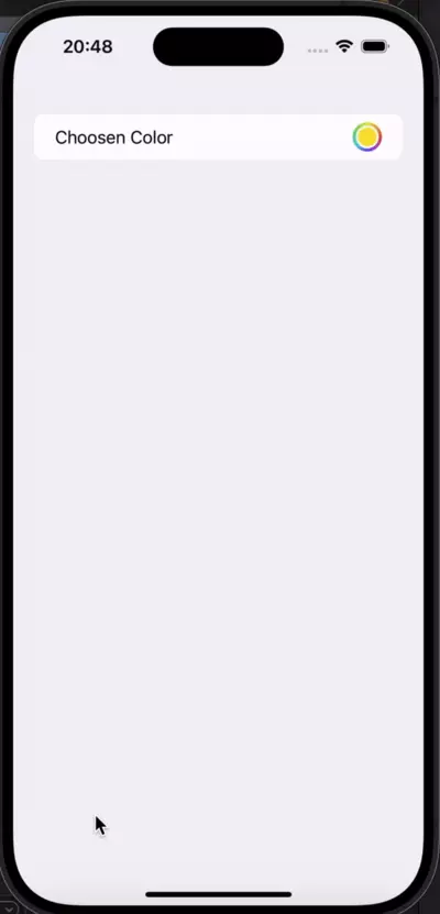
SwiftUI Color Picker
The Color Picker is one of the new additions in recent iOS versions, and it really simplifies our life when we want to let a user choose from a palette of colors.
In a way, this is simpler than all the previously seen Pickers, since it doesn’t even have a style property. Very simple to declare and use, it provides us with a seamless experience that we can easily implement in our apps.
@State private var bgColor = Color(
  .sRGB,
  red: 0.98,
  green: 0.9,
  blue: 0.2)

var body: some View {
  List {
    ColorPicker(
      "Choosen Color",
      selection: $bgColor)
  }
}
SwiftUI Picker FAQ
What is a SwiftUI Picker?
A SwiftUI Picker is a user interface control that allows users to select an option from a list of choices. It provides a way for users to make selections in a visually appealing and intuitive manner.
How do I create a Picker in SwiftUI?
To create a Picker in SwiftUI, you can use the SwiftUI Picker view along with a data collection and a closure that defines the content of each option. You can customize the appearance and behavior of the Picker using a variety of modifiers.
Can I customize the style of a SwiftUI Picker?
Yes, you can customize the style of a SwiftUI Picker to match the needs of your SwiftUI app. SwiftUI provides various built-in styles such as WheelPickerStyle, SegmentedPickerStyle, and MenuPickerStyle. You can also create your own custom styles using modifiers and SwiftUI’s powerful declarative syntax.
How can I set the default value of a SwiftUI Picker?
To set the default value of a SwiftUI Picker, you can use the @State property modifier to create a binding to a selected value. By initializing the binding with a default value, the Picker will automatically display that value when it first appears.
Can I make SwiftUI Picker options mutually exclusive?
Yes, you can make SwiftUI Picker options mutually exclusive by using the tag(_:selection:) modifier. By providing a unique tag value for each option and binding the Picker’s selected value to a variable, only one option can be selected at a time.
How can I change the style of a SwiftUI Picker dynamically?
To change the style of a SwiftUI Picker dynamically, you can use conditional modifiers. By applying different styles based on certain conditions, you can provide a dynamic user experience and enhance the visual appearance of your app.
Can a SwiftUI Picker display images or symbols?
Yes, a SwiftUI Picker can display images or symbols alongside or instead of text options. You can use the label parameter of the Picker’s content closure to provide custom views, such as images or SF Symbols, for each option in the Picker.
import SwiftUI

struct ImagePickerView: View {
    @State private var selectedSymbol: String = "circle"
    let symbols = ["circle", "square", "triangle"]

    var body: some View {
        Picker("Select a symbol", selection: $selectedSymbol) {
            ForEach(symbols, id: \\.self) { symbol in
                HStack {
                    Image(systemName: symbol)
                    Text(symbol.capitalized)
                }
                .tag(symbol)
            }
        }
        .pickerStyle(SegmentedPickerStyle()) // You can choose the style that suits your UI
    }
}

struct ImagePickerView_Previews: PreviewProvider {
    static var previews: some View {
        ImagePickerView()
    }
}
To sum up
SwiftUI Pickers are great tools that provide us with clear selection mechanisms for every single type of option we may need to display to our users. As an iOS developer writing a SwuiftUI app, it’s important that you get a good understanding on using SwiftUI Pickers, because it’s one of the most basic user interface interactions in any iOS app.
There are three main types of Pickers:
- The Picker
- The Date Picker
- The Color Picker
While we can do everything by customizing a Picker, it is wise to use one of the other two types when we need Dates/Colors.
We’ve also looked into the many sub-variants of each, and hopefully, with the animated GIFs that show up alongside to illustrate how they’re configured, these examples can help you understand which one is needed on your specific implementation.
We will highlight some practical picker implementations in a forthcoming article, which will dive into how to use Forms and make user profiles or settings screens using SwiftUI. So stay tuned and happpy coding!
Expect The Unexpected!
Debug Faster With Bugfender