14 Minutes
SwiftUI Grid: Learn to build complex layouts
Fix Bugs Faster! Log Collection Made Easy
In this article we’ll look at Grids in SwiftUI. We’ll see what they are, how they are used, and explain tricks for how to use them in our SwiftUI app. This is a technical article that is heavily code-based. But we’ll aim to be simple and concise, so you can learn something new regardless of your technical level.
Table of Contents
What are grids?
Grids are UI elements in SwiftUI. The SwiftUI Grid system offers significant flexibility and can handle a wide range of grid layout needs, from simple arrangements to complex, adaptive designs.
The main components involved in creating grids in SwiftUI are LazyVGrid and LazyHGrid. As their names suggest, these components allow for vertical and horizontal grids, respectively, and they both use lazy loading to optimize performance by loading views on demand.
Understanding LazyVGrid and LazyHGrid
Our Grids need to be either LazyVGrid if we are going for a vertical grid view, or LazyHGrid if we’re looking to have a horizontal grid view. They are very similar, and they both have the same requirements:
- Grid Item Definitions – They define the layout of each column (
LazyVgrid), or row (LazyHGrid). - Content: The views to be displayed in our Grid items
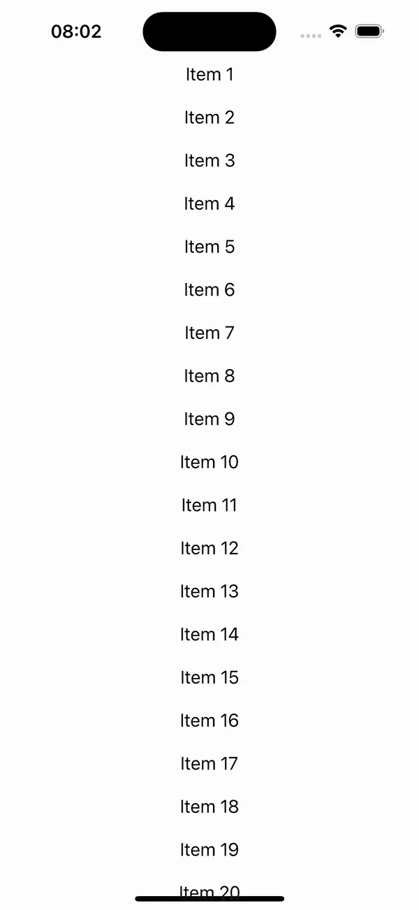
Let us look at a simple LazyVGrid, in which each element is just a Text View showing the index of the element in question:
Using LazyVGrid
First we’ll have a LazyVGrid, which will make our Grid vertical:
struct ContentView: View {
    let items = Array(1...100).map { "Item \($0)" }
    let columns = [
        GridItem(.flexible())
    ]

    var body: some View {
        ScrollView {
            LazyVGrid(columns: columns, spacing: 20) {
                ForEach(items, id: \.self) { item in
                    Text(item)
                }
            }
        }
    }
}

#Preview {
    ContentView()
}
Using LazyHGrid
Now let’s make a horizontal grid, with LazyHGrid, to see the similarities between them:
struct ContentView: View {
    let items = Array(1...100).map { "Item \($0)" }
    let rows = [
        GridItem(.flexible())
    ]

    var body: some View {
        ScrollView(.horizontal) {
            LazyHGrid(rows: rows, spacing: 20) {
                ForEach(items, id: \.self) { item in
                    Text(item)
                }
            }
        }
    }
}

#Preview {
    ContentView()
}
Looking at the code, they appear very similar, The main difference is the ScrollView being horizontal, and the grid column and grid row initialisation properties, respectively.
Grid UI Customisation
We’ve created two different grids, but they don’t look particularly pleasing to the eye, or even useful at this point. In this chapter, we’ll look at how to apply some basic customization to the UI, so that it better adapts to our needs.
GridItem
The GridItem is very important for defining the behaviour and appearance of the grid’s columns or rows. SwiftUI provides several configuration options for GridItem:
- Size:
.fixed,.flexible, or.adaptive - Spacing: Space between columns or rows
- Alignment: Alignment of items within their cells
Size Options
- .fixed: A fixed size for each column or row. This is useful when you need precise control over the dimensions and need a specific width or height.
GridItem(.fixed(100)) - .flexible: A flexible size that adjusts based on available space. This is useful for responsive designs. As you can see, you can define a minimum and a maximum width or height.
GridItem(.flexible(minimum: 100, maximum: 200)) - .adaptive: Adapts to fit as many items as possible in the available space, with a minimum and maximum size constraint.
GridItem(.adaptive(minimum: 80, maximum: 120))
Spacing and Alignment
You can customize the spacing between grid items and their alignment within the cells:
- Spacing: Define horizontal or vertical spacing between items.
LazyVGrid(columns: [GridItem(.flexible(), spacing: 20)]) - Alignment: Align items within their grid cells.
LazyVGrid(columns: [GridItem(.flexible(), alignment: .leading)])
Mixed Grid Layouts
SwiftUI’s grid system can handle more than just simple uniform grids. You can mix and match different types of GridItem configurations to create intricate layouts with multiple columns or other any other custom layout beyond a simple grid.
Mixed Grid Items
You can mix GridItem types to achieve complex layouts. For instance, combining fixed, flexible and adaptive items:
let mixedColumns = [
    GridItem(.fixed(50)),
    GridItem(.flexible()),
    GridItem(.adaptive(minimum: 80))
]
Grid Use Case Examples
We’ve seen how to configure the size, spacing and alignment of our GridItems, so now let’s see two real-world use cases in which Grids shine.
Image Gallery
One great (and common) use of Grids in iOS applications is to create image galleries. For this example we’ll use upsample.net to create our library of images, and they’ll be Full HD (1920×1080). We’ll add them to our Assets folder and we will show them on a grid. You can also make a system to let the user choose images from their own gallery, but to simplify the example we’re just going to use them straight from the Assets folder.
struct ContentView: View {
    let items = Array(1...20).map { "image-\($0)" }
    let rows = [
        GridItem(.fixed(200)),
        GridItem(.fixed(200)),
        GridItem(.fixed(200)),
    ]

    var body: some View {
        ScrollView(.horizontal) {
            LazyHGrid(rows: rows, spacing: 20) {
                ForEach(items, id: \.self) { item in
                    Image(item, bundle: nil)
                        .resizable()
                        .aspectRatio(1.77, contentMode: .fill)
                }
            }
        }
    }
}

#Preview {
    ContentView()
}
There we have our images, being shown in three horizontal lines. We have decided to make them .fixed size so they all look alike, but you can try mixing up other size properties to see which you prefer.
Product Catalog
struct ContentView: View {
    let products = Array(1...100).map { "Product \($0)" }

    let columns = [
        GridItem(.flexible()),
        GridItem(.flexible())
    ]
    var body: some View {
        ScrollView {
            LazyVGrid(columns: columns, spacing: 20) {
                ForEach(products, id: \.self) { product in
                    VStack {
                        Rectangle()
                            .fill(Color.random)
                            .frame(height: 150)
                        Text(product)
                            .font(.headline)
                    }
                    .background(Color.white)
                    .cornerRadius(10)
                    .shadow(radius: 5)
                }
            }
            .padding()
        }
    }
}

struct ContentView_Previews: PreviewProvider {
    static var previews: some View {
        ContentView()
    }
}
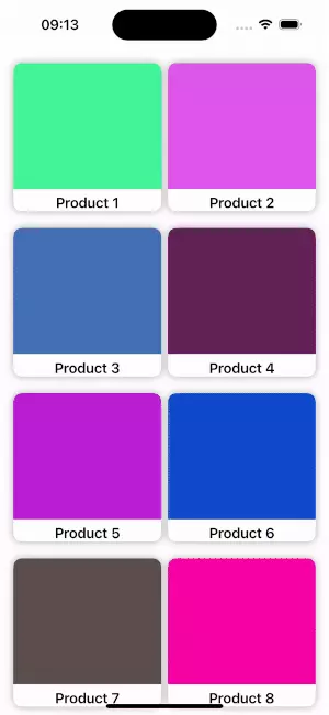
Our Product catalog is now ready. We made it with a flexible width, so it adapts to the screens it’ll be displayed on. Again, we invite you to adjust those sizes to see which you prefer.
As for the items UI, the random Color for our items was added to our app through the use of Extensions. The following Extension does the trick:
extension Color {
    static var random: Color {

        return Color(
            red: Double.random(in: 0.0...1.0),
            green: Double.random(in: 0.0...1.0),
            blue: Double.random(in: 0.0...1.0))
    }
}
If you’d like to learn more about Extensions, or about Colors, we have articles about them here, and here.
iPad Considerations
A common question we receive from designers relates to displaying a certain amount of items on the iPhone, but a different amount on the iPad grid container. While we have been initializing the rows/columns with a let, we can make them variable and change them in runtime to create a flexible view. Let us imagine, for example, that our previously shown product catalog was supposed to show, as we have, two columns on iPhone and four columns on the iPad.
The required changes would be minimal, as we’ll see now:
- Make the columns a variable array by changing:
let columns = [ GridItem(.flexible()), GridItem(.flexible()) ]to:var columns = [ GridItem(.flexible()), GridItem(.flexible()) ] - Add an init to our View; this checks whether the device is an iPad or not:
init() { if UIDevice().userInterfaceIdiom == .pad { columns.append(contentsOf: [ GridItem(.flexible()), GridItem(.flexible()) ]) } }
That’s it. Our update code with iPad support now looks like this:
struct ContentView: View {
    let products = Array(1...100).map { "Product \($0)" }

    var columns = [
        GridItem(.flexible()),
        GridItem(.flexible())
    ]

    init() {
        if
            UIDevice().userInterfaceIdiom == .pad {
            columns.append(contentsOf: [
                GridItem(.flexible()), GridItem(.flexible())
            ])
        }
    }

    var body: some View {
        ScrollView {
            LazyVGrid(columns: columns, spacing: 20) {
                ForEach(products, id: \.self) { product in
                    VStack {
                        Rectangle()
                            .fill(Color.random)
                            .frame(height: 150)
                        Text(product)
                            .font(.headline)
                    }
                    .background(Color.white)
                    .cornerRadius(10)
                    .shadow(radius: 5)
                }
            }
            .padding()
        }
    }
}
As you can see in the previous code we create the initial view and then we adapt in runtime from two flexible columns to four columns on iPad devices. Each grid cell contains a rectangle with a random fill color and the product name displayed as a headline text. The grid cells have a white background with rounded corners, a shadow effect, and 20 spacing between them.
Summing Up
Grids are a great way to show content in our apps and using the lazy grid views provided by SwiftUI framework can help you to build any complex layout your app might require. So mastering grids can really help you on your career as iOS developer.
There are two types of grid:
LazyHGrid– For Horizontal contentLazyVGrid– For vertical content
Grid Items are used for configuration of each item, and there are three main things we can configure them with:
- Size – Defines how each item gets sized, and can be fixed, flexible, or adaptive
- Spacing – Used to define the distance between items
- Alignment – Similar to spacing, used to define how each item aligns
We’ve also seen two examples of grid usage, with an image gallery and a Product catalog that even looks different between iPhone and iPad.
We hope this article has been helpful and provides good insights on how, and where, to use grids in your apps!
Expect The Unexpected!
Debug Faster With Bugfender


