Creating a visually captivating, interactive user interface is fundamental to our work as developers. And SwiftUI, Apple’s declarative UI framework, is a game-changer, providing views, controls and layout structures for the iOS, macOS, watchOS and tvOS operating systems.
Of all SwiftUI’s many components, SwiftUI buttons stand out as particularly crucial elements for user interaction. And today we’ll explore the nuances of SwiftUI buttons, offering a step-by-step tutorial that will assist developers of all skill levels.
All the code in this article can be tested on Swift Playground. You can access Swift Playground via the following link: Swift Playground
With Swift Playground, you have the opportunity to explore our provided examples about SwiftUI button functionality firsthand or also try other UI components like SwiftUI Pickers. By providing you with a playground-like environment, it allows you to quickly iterate on your code, visualize the changes, and gain a deeper understanding of how different components work together to create stunning button designs.
Creating a SwiftUI button requires us to bring interactive elements to life. You start with the basic setup, defining the buttons’ appearance and size. Then you add actions to make them do something exciting when the user clicks or taps them. It’s a fundamental first step in crafting a user-friendly and engaging interface.
Basic SwiftUI button setup
Let’s start with the basics: SwiftUI simplifies button creation with a dedicated ‘Button’ view.
When creating a button, it is imperative to incorporate two segments of code:
Action code. The code in this fragment must clearly define the set of actions to be executed when the user taps or selects the button.
Appearance code. The code in this block should define the visual aspects and overall look and feel of the button.
To establish a button, you need to specify an action and a label.
The action can consist of either a method or closure property that triggers an event when a user clicks or taps the button.
On the other hand, the label ensures a comprehensive representation of the button’s purpose by presenting text, an icon, or a combination of both.
The fundamental structure is concise, as you can see below:
// Structure to create button

Button(action: {
// write the business logic here. It will execute after button clicked
}) {
   // Here the button will design
}
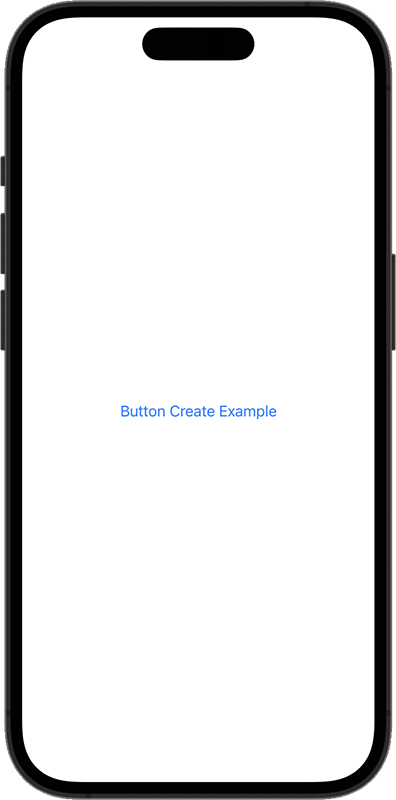
// Example to create button

import SwiftUI

struct ContentView: View {
   var body: some View {
       Button(action: {
           print("Button Clicked!")
       }) {
          Text("Button Create Example")
					.foregroundColor(.blue)
          }
        }
     }
Console Output :

// Button Clicked!
When designing buttons, it’s crucial to provide maximum accessibility by avoiding labels that rely solely on images or visual components, without accompanying accessibility labels.
For iOS and watchOS, users activate the button by tapping on it, embracing the intuitive touch interaction that defines these platforms. In the macOS environment, the button is activated through a click, aligning with the traditional mouse-based interaction that users are accustomed to on desktops. On tvOS, the interaction is unique – users press the “select” button on an external remote, such as the Siri Remote, while focusing on the Xcode button.
A range of factors including placement, assigned role, and styling collectively contribute to the overall user experience and visual presentation of the Xcode button. Designers can ensure a consistent, appropriate user experience across iOS, watchOS, macOS and tvOS by carefully considering platform-specific activation strategies and designing buttons appropriately.
Adding actions to a SwiftUI button
Roles are another crucial aspect of Swift buttons, allowing developers to define a button’s purpose. To assign a role to a button, developers should utilize the role enumeration during the button creation process.
Several predefined roles are available, such as .destructive and .cancel, each having its own specific styling. For instance, the .destructive role often results in a button with a red foreground color, indicating a potentially harmful action like deletion. On the other hand, the .cancel role is useful for buttons that dismiss or halt an operation.
When buttons are combined with actions, they become strong. Actions can range from navigating to another screen to submitting a form. Here’s a simple example:
This example highlights the dynamic capabilities buttons provide to your user interface, showcasing a button labeled “Submit” with an accompanying action.
Further enhance your Swift development skills by exploring our insightful article on working with Swift Dates, a crucial aspect of iOS development.
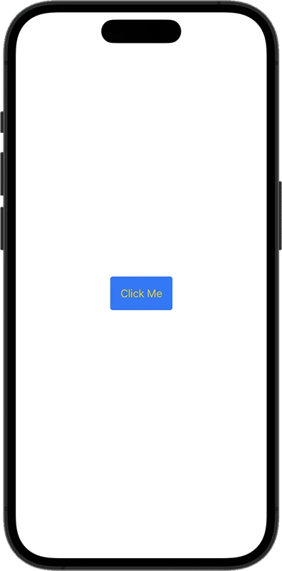
In SwiftUI, you’re not limited to a one-size-fits-all approach when it comes to buttons. With the variety of ready-to-use button styles the framework provides, developers may easily modify the appearance and functionality of their buttons quickly.
But that’s not all. SwiftUI goes a step further, empowering developers to craft their own custom button styles and opening the door to a world of unique designs and interactions.
When you opt for the system buttons, you’re tapping into a treasure trove of styles that come with built-in perks. These include out-of-the-box interaction states like pressed animations and a disabled state, as well as accessibility features and adaptive appearances that make your buttons user-friendly and versatile across different contexts, as well as visually appealing.
This code snippet demonstrates a button with a custom appearance. The foregroundColor sets the text color, background defines the button color, and padding adds spacing around the button.
Styling with shapes and shadows
You can conveniently adjust button sizes in SwiftUI by utilizing the controlSize(_:) modifier. By applying this modifier to a button, you can replace the default system size with any of the control sizes listed in the controlSizeenumeration.
This makes it possible for you to create buttons with the exact proportions you want, such as .mini , .small , and .regular , guaranteeing that the button size precisely fits the application’s contextual requirements.
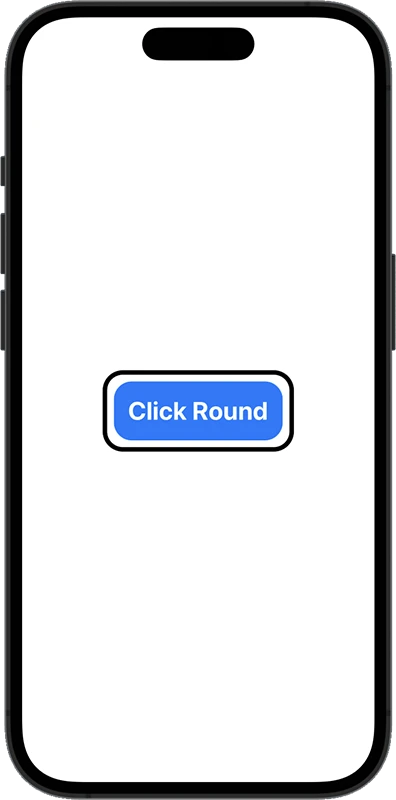
Remember: Buttons need not be confined to rectangular shapes. SwiftUI empowers developers to use custom shapes and shadows, adding a touch of elegance:
This example showcases a bordered button with a round rectangular shape and a black stroke, demonstrating how SwiftUI enables creativity in button design. Let’s take a detailed look at the code:
The button label is styled with various modifiers as follows:
.fontWeight(.bold): Makes the font weight bold.
.font(.title): Sets the font style to title, a predefined SwiftUI style.
.background(Color.blue): Sets the background color to blue.
.cornerRadius(20): Rounds the corners of the button with a radius of 20.
.foregroundColor(.white): Sets the color of the text to white.
.padding(10): Adds additional padding around the already styled text.
Then it adds an overlay rounded rectangle on top of the button. The rectangle has a corner radius of 20, a black border (stroke), and a line width of 5. This gives the button a bordered effect.
Using Button Style protocol
To ensure a consistent design throughout your application, SwiftUI provides the flexibility to define a custom button style utilizing the ButtonStyle protocol. By implementing this protocol, you can easily apply the same button appearance to multiple buttons, guaranteeing a consistent look and feel across your entire app.
Now let’s look at how you achieve this creating your custom ButtonStyle protocol implementation:
In this example, a custom button SwiftUI style is clearly defined, providing a distinct appearance. The buttonStyle modifier applies this style to the button. Later on, you can reuse this ButtonStyle to other buttons, ensuring a cohesive design throughout your application.
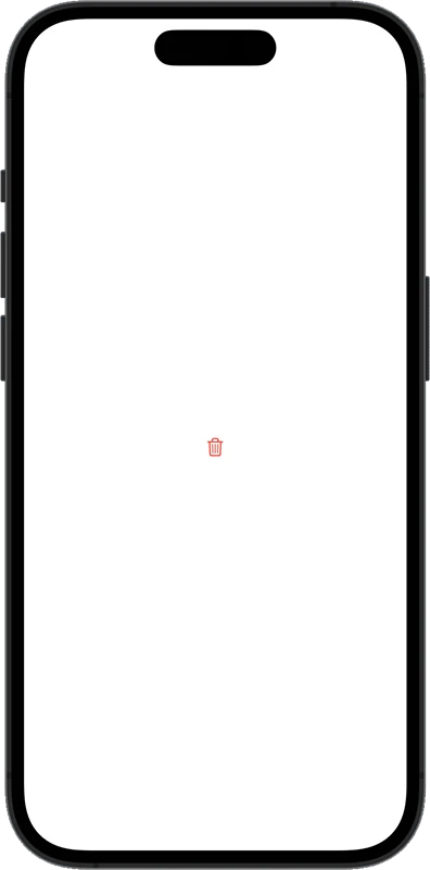
SwiftUI button with images
SwiftUI buttons can incorporate more than just text; they can also include images for a more engaging user interface.
This code creates a button with a delete icon, showcasing how SwiftUI seamlessly integrates images within buttons. In this case we have used a system provided Icon, but you can use any image you want.
Deepen your Swift knowledge by exploring our detailed article on Swift Collections, where you’ll learn how to effectively manage and utilize data structures alongside SwiftUI interfaces.
SwiftUI button animation adds a layer of dynamism to your app, enhancing the overall user experience. This simplifies the process of animating buttons, and makes them more engaging.
At its core, a SwiftUI button action provides a set of instructions that dictates what happens when a user interacts with your button. It’s the dynamic response to a tap, click, or any other gesture.
When you set up a button action, you’re essentially telling your app “Hey, when someone interacts with this button, here’s what you should do.”
Setting up button logic
Here’s where you craft the intricate dance steps of your UI. The set-up process isn’t just about a click; it’s about orchestrating a ballet of actions. You’re the puppeteer, pulling the strings to make your app sing in harmony with user input. Each piece of logic you set is a stroke on the canvas of user experience, turning your app into a masterpiece of seamless interaction.
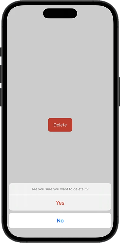
Buttons are not just about appearances; they serve as powerful tools for implementing app logic. You can use them to trigger specific actions or navigate between different parts of your app. Here is an example of how to open dialog on button click.
import SwiftUI

struct ContentView: View {
       @State private var isShowingDialog = false
        var body: some View {
          Button("Delete", role: .destructive) {
               isShowingDialog = true
           }
           .buttonStyle(.borderedProminent)
           .controlSize(.large)
           .confirmationDialog("Are you sure you want to delete it?", isPresented: $isShowingDialog, titleVisibility: .visible) {
              Button("Yes", role: .destructive) {
                   // set logic after click Yes button
                }
              Button("No", role: .cancel) {
                  // set logic after click No button
                }
          }
       }
    }
In this example, pressing the button triggers the display of an alert dialog with two buttons: “Yes” and “No”.
Providing user feedback
Now, let’s talk about the red carpet moment – providing user feedback.
Your buttons aren’t just silent performers; they crave applause, and user feedback is the standing ovation.
It’s the art of acknowledging every user tap, telling them, “Hey, you did it!”. It’s the secret sauce that turns a transaction into an experience, leaving your users with a smile and a sense of accomplishment. With the help of SwiftUI’s sensoryFeedback() modification, you can create vibrant effects for a variety of scenarios, including impacts, failure, success and selection.
You can attach the sensoryFeedback() function to any view to initiate feedback. This function instructs the view on what kind of effect to create, and when to trigger it. Whenever the trigger value changes, SwiftUI will keep an eye on it and launch your haptic effect.
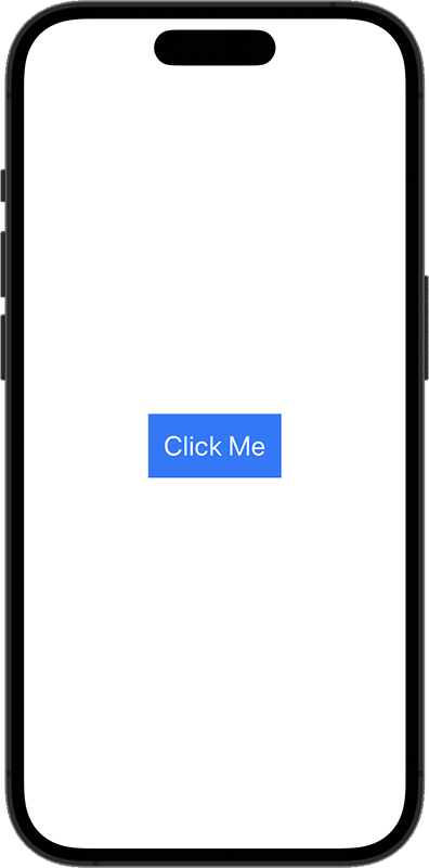
For instance, you could play a haptic after a task is marked as completed if you had a button for that purpose:
import SwiftUI

struct ContentView: View {
    @State private var randNum = 0.0

    var body: some View {
        Button("Click Me") {
            randNum = Double.random(in: 0...1)
        }
        .sensoryFeedback(trigger: randNum) { oldValue, newValue in
            let amount = abs(oldValue - newValue)
            return .impact(flexibility: .solid, intensity: amount)
        }
    }
}
To sum up
SwiftUI buttons are versatile elements that empower developers to create intuitive, visually stunning user interfaces. Whether you’re a novice exploring SwiftUI for the first time or an experienced developer seeking to enhance your UI skills, mastering SwiftUI buttons is a valuable asset.
SwiftUI has transformed the way developers approach user interface design, and buttons are a fundamental part of this evolution. Whether you’re a beginner or an experienced developer, mastering SwiftUI buttons will undoubtedly elevate your app development skills. So, go ahead, experiment, and make your buttons shine.
Anupam Singh is a Native Android Developer as well as Hybrid Mobile App Developer. More than 10 years of experience in Developing Mobile Apps. He is a technology blogger. Follow him on Linkedin to stay connected.