26 Minutes
Complete Guide to SwiftUI List for Developers
Fix Bugs Faster! Log Collection Made Easy
Whether it’s the groceries you need from the store, the chores your mom left on the kitchen counter for when you got home from class, or even things to do before you die, lists are everywhere.
Presenting data in a column (or a list) is the most familiar and natural way to organize information in both the analogue and digital worlds. Think about scrolling through your timeline on a social media platform, or browsing products on an e-commerce site – almost all modern applications utilize column/list-based displays to present data.
In this article we’ll be taking a look at how the List view component in SwiftUI helps us display data in our apps, creating attractive interfaces and satisfying experiences for users.
Let’s get started.
Table of Contents
What is a List in SwiftUI?
We all know what a list is, but when we’re talking about UI elements it’s important to be specific. Put simply, in UI a SwiftUI List is a SwiftUI view container that allows us to show a single Column of either static elements set during development, or dynamic elements which adapt to defined data sources.
In addition, SwiftUI Lists can support adding or removing elements dynamically, as well as navigation between screens, all of which we’ll be looking at today.
Let’s start by taking a look at the different types of List we can build using SwiftUI.
Static SwiftUI Lists
We’ll begin with a simple static List containing seven text views (the days of the week). To se this up, we just update the contents of the body variable as follows:
struct ContentView: View {
    var body: some View {
        List {
            Text("Monday")
            Text("Tuesday")
            Text("Wednesday")
            Text("Thursday")
            Text("Friday")
            Text("Saturday")
            Text("Sunday")
        }
    }
}

#Preview {
    ContentView()
}
Now we can use the Preview Window to see how this is presented in the UI and we should see something like this:
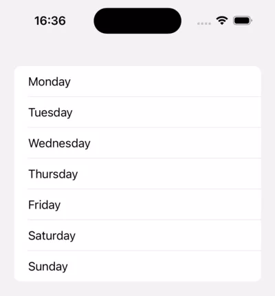
Great! We just created a static SwfitUI list view containing seven list rows with a text view in each row.
Pretty simple, right? Let’s try something a little more complex.
SwiftUI Dynamic List
As we’ve seen, creating a static SwiftUI list using the List structure could not be more straightforward, in reality though, there’ll be many scenarios where we’ll need our lists to present data that will change over time (think about a news app with a list of stories) and that’s where SwiftUI dynamic lists come in.
Fortunately, the List structure includes functionality that allows us to present dynamic data from sources like databases or APIs, updating our list in the UI as and when the source data changes.
To demonstrate this, we’ll update the Swift code of our static list as below:
struct ContentView: View {
    var daysOfTheWeek: [String] = [
        "Monday",
        "Tuesday",
        "Wednesday",
        "Thursday",
        "Friday",
        "Saturday",
        "Sunday"
    ]

    var body: some View {
        List(daysOfTheWeek,
	    id: \.self){ day in
            Text(day)
        }
    }
}

#Preview {
    ContentView()
}
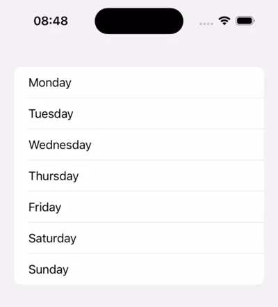
Now if we preview our UI, it should look like this:
You might be wondering what the code id: \.self is for – this allows the SwiftUI list to compare the latest data provided by the source with the previous version to see what’s changed.
An easy way to understand this is to imagine two identical cars (same make, model, color etc.) which would be impossible to tell apart without some sort of unique identifier such as a license plate.
Similarly, dynamic lists need to be able to uniquely identify any element they receive from the source, this is straightforward if the the elements for each list item are conforming with the Identifiable protocol, in which case we’d simply have:
List(identifiableCollection){ collectionItem in
    ...
}
However, as we have an Array of Strings with the days of the week, and Strings are not identifiable data, we need \.self to create a keypath, effectively telling the system that each item is identifiable by itself. Once the system knows how to identify each item row we can use them in the List.
Alternative ways of displaying dynamic lists
The most common way of displaying a SwiftUI List is how we’ve just seen:
List(daysOfTheWeek,
    id: \.self){
        day in
        Text(day)
}
However there are alternative code approaches for displaying lists, one example is the ForEach method shown below:
List {
    ForEach(daysOfTheWeek, id: \.self) { day in
        Text(day)
    }
}
Both approaches create exactly the same List UI, but the ForEach method is required in certain scenarios we will discuss in this article, one of which is lists that combine both static and dynamic content. Let’s take a closer look.
SwiftUI static and dynamic lists
Creating a SwifUI list with a combination of both static and dynamic content can only be achieved using the ForEach method of displaying List elements.
This is actually pretty simple to set up, we just have the static elements by themselves and then wrap any dynamic elements on using a ForEach.
Let’s put this into practice by breaking the two lists we’ve created apart, making the first and last days of the week static, and any days between dynamic.
To do this our View should look like the below:
struct ContentView: View {
    var daysOfTheWeek: [String] = [
        "Tuesday",
        "Wednesday",
        "Thursday",
        "Friday",
        "Saturday",
    ]

    var body: some View {
        List {
            Text("Monday")

            ForEach(daysOfTheWeek, id: \.self) { day in
                Text(day)
            }

            Text("Sunday")
        }
    }
}

#Preview {
    ContentView()
}
And our UI like this:
While there isn’t any immediate change to the way the list appears in the UI, the capability of the list to display different types of data in each list row is now significantly enhanced. Next we’ll take a look at how we can use this in practice.
Breaking lists down into sections
Lists might just be vertical columns of elements, but they can still be broken into smaller parts or divided into sections to create more logical and intuitive user experiences.
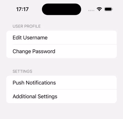
We’ll demonstrate this with a List of four text views (in this case profile settings) that we’d like to present in two different sections, which we do by updating our View as below:
struct ContentView: View {
    var body: some View {
        List {
            Section("User Profile") {
                Text("Edit Username")
                Text("Change Password")
            }
            Section("Settings") {
                Text("Push Notifications")
                Text("Additional Settings")
            }
        }
    }
}

#Preview {
    ContentView()
}
A quick look at the Preview Window shows our UI looks like this:
Good job! Now let’s take this a step further.
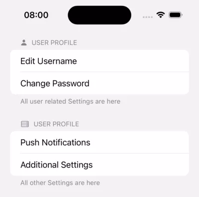
We know how to add Sections to our Lists, but what if we also wanted to show custom elements in both the header and the footer. To do this we need to provide Views for those elements on our Section declaration.
To demonstrate we’ll add:
- A header that will have an image (using an
SFSymbol) and a title - A footer that’s just
Text
Which we’ll do like this:
struct ContentView: View {
    var body: some View {
        List {
            Section(header: SectionHeader(
                sfSymbolName: "person.fill",
                text: "User Profile"),
                    footer: Text("All user related Settings are here")){
                Text("Edit Username")
                Text("Change Password")
            }
            Section(header: SectionHeader(
                sfSymbolName: "server.rack",
                text: "User Profile"),
                    footer: Text("All other Settings are here")) {
                Text("Push Notifications")
                Text("Additional Settings")
            }
        }
    }
}

struct SectionHeader: View {
    var sfSymbolName: String
    var text: String

    var body: some View {
        HStack {
            Image(systemName: sfSymbolName)
            Text(text)
        }
    }
}

#Preview {
    ContentView()
}
Our UI will now look like this, with the header symbol and footer text displayed:
Awesome! Next we’ll take a look at how we can generate list sections dynamically.
Dynamically generated sections on lists
Just like when creating a List with both dynamic and static content, to include a dynamically generated section or sections, we’ll again need to use ForEach to generate the elements.
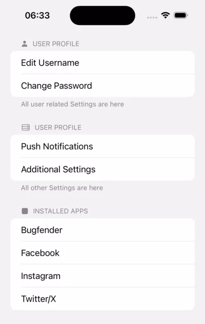
To demonstrate, let’s add a section to our ‘User Profile’ and ‘Settings’ List to show apps installed on the user’s device, just like we’d find in iOS settings.
We can do this by adding an Array of installed apps on our ContentView and creating a new Section below the existing two, like this:
struct ContentView: View {
    var installedApps = [
        "Bugfender",
        "Facebook",
        "Instagram",
        "Twitter/X"
    ]
    var body: some View {
            ...
            Section(header: SectionHeader(
            sfSymbolName: "app.fill",
            text: "Installed Apps")) {
                ForEach(installedApps, id: \.self) {
                    Text($0)
                }
            }
        }
    }
}
Now our UI will look like this:
Fantastic. Now let’s take a look at how be can enable users to add and remove elements to and from lists in the UI.
Adding and removing list elements in the UI
It’s only possible to add and remove elements to/from the dynamic parts of a List, as static elements cannot be added or removed while an app is running. Because of this our list will need to be either fully dynamic, or at least include a dynamic section, for us to be able to add or remove elements.
Adding list elements in the UI
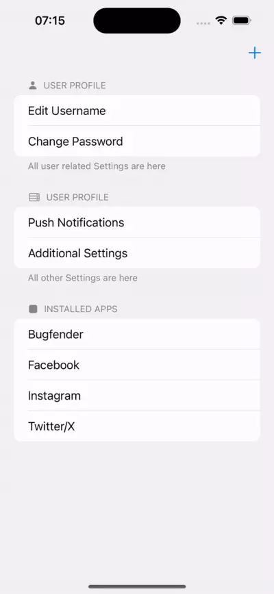
Of course, we just added a dynamic ‘Installed Apps’ section to our list and we can use this to demonstrate how we would add more apps to this.
We’ll start by adding a plus button at the top right side of our screen which, when clicked, will add a random app name to our array of apps. We have an array of popular app names for this and when we’ve added them all, we won’t add any further.
These are the changes we need to make:
- Turn our collection into a
@Statevariable, so that ourListupdates on the spot - Create the Array of
popularAppNameswith several app names for us to use - Wrap our
Listin aNavigationStack, so we can haveNavigation Bartop buttons - Add the
.toolbarmodifier to add the toolbar button previously mentioned
With these changes applied, our view will look like this:
@State var installedApps = [
    "Bugfender",
    "Facebook",
    "Instagram",
    "Twitter/X"
]

var popularAppNames = [
    "Bugfender", "Instagram", "Snapchat", "TikTok", "Facebook", "WhatsApp",
    "YouTube", "Twitter/X", "Netflix", "Spotify", "Pinterest", "Google Photos",
    "Zoom", "Google Maps", "Gmail", "Messenger", "Amazon", "Skype",
    "Uber", "Lyft", "Airbnb", "Microsoft Teams", "Discord",
    "LinkedIn", "Google Drive", "Dropbox", "Microsoft Word", "Microsoft Excel",
    "Microsoft PowerPoint", "Google Chrome", "Safari", "Adobe Acrobat Reader",
    "WhatsApp Business", "Zoom for Intune", "Netflix for iPad", "Google Classroom",
    "Reddit", "Snapchat for iPad", "Amazon Shopping", "Microsoft Outlook",
    "Facebook Pages Manager", "Hulu: Stream TV shows & movies",
    "Waze Navigation & Live Traffic", "Google Translate", "Microsoft OneDrive",
    "Apple Music", "PayPal", "Yelp", "Shazam", "Adobe Photoshop Express", "Tinder"
]
...

NavigationStack {
    List {
			...
    }.toolbar {
        Button("", systemImage: "plus") {
            let difference = Set(installedApps).symmetricDifference(Set(popularAppNames))

            if (difference.isEmpty) {
                return
            }

            installedApps.append(Array(difference)[Int.random(in: 0..< difference.count)])
        }
To find out which apps have been installed and which have not, we can use symmetricDifference provided by the Set Collection, if you’d like to know more about that, you can read about it here.
The result in the UI can be seen here:
Removing elements from lists in the UI
That’s how we add elements to lists but how can we delete them? Remember, elements can only be deleted from the dynamic parts of a List, which we can do by deleting them from the data source.
First, as per standard iOS functionality, we want a delete button on a swipe left, and for this we need to add the following to the ForEach that is creating the dynamic elements:
.onDelete(perform: { indexSet in

})
This takes in an indexSet, from which we’ll be interested in the index of the first element so we can remove our selection from our installedApps.
The finished ForEach should look like:
ForEach(installedApps, id: \.self) {
    Text($0)
}.onDelete(perform: { indexSet in
    guard let index = indexSet.first else { return }

    installedApps.remove(at: index)
})
This will allow the user to remove an item at the specified index by swiping it to the left.
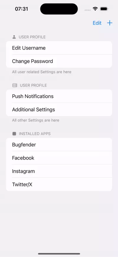
Another option is to set the entire List into edit mode, and provide a red delete button on the left of each item. This process is mainly automated by the system i.e. .onDelete, so we just need to add the default EditButton() to our toolbar.
To do that we’ll need to wrap our toolbar add button onto an HStack so both can fit, like this:
.toolbar {
   HStack {
     EditButton()
     Button("", systemImage: "plus") {
           let difference = Set(installedApps).symmetricDifference(Set(popularAppNames))

            if(difference.isEmpty){
                return
             }

             installedApps.append(Array(difference)[Int.random(in: 0..<difference.count)])
      }
  }
}
This is how our UI will look once we’re done:
Good job! We’ve covered a lot of ground but before we finish, let’s take a quick look at navigation.
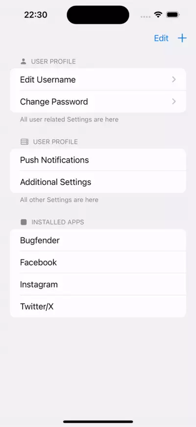
Navigation on Lists, is very straightforward, since we just need to wrap the rows to which we want to add navigation functionality in a NavigationLink.
To demonstrate we’re going to wrap both Edit Username and Change Password in NavigationLinks, and navigate to simple pages with only a Text describing what the page would be.
This is achieved by editing them as follows:
NavigationLink {
    Text("Username Edit screen")
} label: {
    Text("Edit Username")
}
NavigationLink {
    Text("Change Password Screen")
} label: {
    Text("Change Password")
}
That’s it!
Now we have a SwiftUI project with a SwiftUI List view that allows your users to easily navigate between different screens of your app.
Finalised view
Now we can see all our code in action in our finalised View:
struct ContentView: View {
    @State var installedApps = [
        "Bugfender",
        "Facebook",
        "Instagram",
        "Twitter/X"
    ]

    var popularAppNames = [
          "Bugfender", "Instagram", "Snapchat", "TikTok", "Facebook", "WhatsApp",
        "YouTube", "Twitter/X", "Netflix", "Spotify", "Pinterest", "Google Photos",
        "Zoom", "Google Maps", "Gmail", "Messenger", "Amazon", "Skype",
        "Uber", "Lyft", "Airbnb", "Microsoft Teams", "Discord",
        "LinkedIn", "Google Drive", "Dropbox", "Microsoft Word", "Microsoft Excel",
        "Microsoft PowerPoint", "Google Chrome", "Safari", "Adobe Acrobat Reader",
        "WhatsApp Business", "Zoom for Intune", "Netflix for iPad", "Google Classroom",
        "Reddit", "Snapchat for iPad", "Amazon Shopping", "Microsoft Outlook",
        "Facebook Pages Manager", "Hulu: Stream TV shows & movies",
            "Waze Navigation & Live Traffic", "Google Translate", "Microsoft OneDrive",
        "Apple Music", "PayPal", "Yelp", "Shazam", "Adobe Photoshop Express", "Tinder"
    ]

    var body: some View {
        NavigationStack {
            List {
                Section(header: SectionHeader(
                    sfSymbolName: "person.fill",
                    text: "User Profile"),
                        footer: Text("All user related Settings are here")){
                    NavigationLink {
                        Text("Username Edit screen")
                    } label: {
                        Text("Edit Username")
                    }
                    NavigationLink {
                        Text("Change Password Screen")
                    } label: {
                        Text("Change Password")
                    }
                }
                Section(header: SectionHeader(
                    sfSymbolName: "server.rack",
                    text: "User Profile"),
                        footer: Text("All other Settings are here")) {
                    Text("Push Notifications")
                    Text("Additional Settings")
                }

                Section(header: SectionHeader(sfSymbolName: "app.fill", text: "Installed Apps")) {
                    ForEach(installedApps, id: \.self) {
                        Text($0)
                    }.onDelete(perform: { indexSet in
                        guard let index = indexSet.first else { return }

                        installedApps.remove(at: index)
                    })
                }
            }.toolbar {
                HStack {
                    EditButton()
                    Button("", systemImage: "plus") {
                        let difference = Set(installedApps).symmetricDifference(Set(popularAppNames))

                        if(difference.isEmpty){
                            return
                        }

                        installedApps.append(Array(difference)[Int.random(in: 0..<difference.count)])
                    }}

            }
        }
    }
}

struct SectionHeader: View {
    var sfSymbolName: String
    var text: String

    var body: some View {
        HStack {
            Image(systemName: sfSymbolName)
            Text(text)
        }
    }
}

#Preview {
    ContentView()
}
And this is how it looks and works in the UI:
FAQ
How do you handle user interactions with lists in SwiftUI?
User interactions with lists in SwiftUI can be managed by adding action handlers like onTapGesture
for taps or using onAppear and onDisappear to manage the visibility of list items.
Can you customize the appearance of lists in SwiftUI?
Yes, you can customize lists in SwiftUI by modifying cell attributes such as background color, font, and separator style. You can also add headers and footers to organize content.
What different styles can you apply to lists in SwiftUI?
To a SwiftUI List you can apply a list style such as PlainListStyle, GroupedListStyle, and InsetListStyle. Each SwiftUI List style modifies the list’s layout and visual appearance to suit different UI needs. Read more in the Apple documentation.
How do you enable single row selection in a SwiftUI list?
To enable single row selection in a SwiftUI list, you can use a @State property to track the selected item. Bind this property to your list’s selection and update it when a user taps on a row.
What is the way to allow multirow selection in SwiftUI List?
For multirow selection in a SwiftUI list, use the @State property to track selected items as a set. Configure your list to support multiple selections by setting the .multipleSelection.
modifier.
struct ContentView: View {
    @State private var selectedItems = Set<UUID>()
    let items = [Item(id: UUID(), name: "Item 1"), Item(id: UUID(), name: "Item 2")]

    var body: some View {
        List(items, id: \.id, selection: $selectedItems) { item in
            Text(item.name)
        }
        .toolbar {
            EditButton()
        }
    }
}

struct Item: Identifiable {
    let id: UUID
    let name: String
}
To sum up
SwiftUI Lists are great UI tools for displaying content vertically in columns. While this is a straightforward concept, we’ve looked at a number of ways to use lists to display content in simple but user friendly ways to really enhance user experience in your SwiftUI app, including:
- Creating lists with static content, dynamic content, and a combination of both
- Breaking lists down into sections and how to customise these sections
- Adding and deleting dynamic content from lists
- And finally, how we can use lists to navigate to our other
Viewsin our iOS app
We built a demo View including all these concepts and hopefully this has helped with understanding how Lists are used and how they can be deployed in different scenarios and projects. If you need to create more complex layouts, you can use SwiftUI grids, which allows you to create more advanced custom views.
Expect The Unexpected!
Debug Faster With Bugfender